

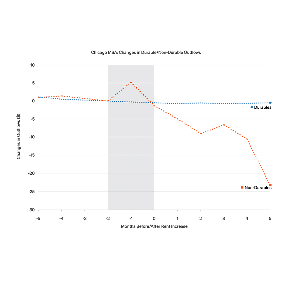
Figure 1: When renters face payment increases, they spend less on nondurable goods.
Latest news

An Ohio-based company is protecting first responders around the world
With support from JPMorganChase, Fire-Dex is providing protective equipment to firefighters in 100 countries and all 50 states.
Learn moreLatest news

Veteran’s Unconventional Path to Landing her Dream Job in Tech
U.S. Army Veteran Ashley Wigfall transitioned to a civilian role and charted her path to technologist through mentorship and skills training at the JPMorgan Chase tech hub in Plano, Texas.
Learn more
Research
March 19, 2025
Housing is a significant share of both expenses and household balance sheets for many families, playing a vital role in day-to-day financial health and longer-term wealth building. Despite its importance, finding affordable housing is a widespread issue in the U.S. for both homeowners and renters. Housing costs keep rising, but income growth has slowed. While these trends are well known nationally, the implications of housing affordability on overall household financial outcomes are not well understood. Moreover, there is a lack of data on how these challenges are experienced locally.
Our work during the past year looks closely at these issues and related economic impacts across the country. This brief highlights findings from ongoing research to provide a more granular view of aspects of housing affordability challenges in Chicago. Specifically, we leverage anonymized data from Chase customers to provide perspectives on the experience of housing affordability among renters and those seeking to transition into homeownership.
Housing affordability is a pervasive and increasing challenge for many families that rent in the Chicago area. In 2023, 45.1 percent of renting families paid rent that was at least 30 percent of their income.1 Moreover, wages in the area have barely kept pace with increases in rents and other costs. In January 2024, rents in the Chicago area were 23.3 percent higher than they were in January 2019, compared to a 20.1 percent increase in the cost of goods overall and a 25.8 percent increase in average wages over a similar period.2
To better explain the impact of these headline rent increases on families, we used deidentified bank data to analyze their subsequent spending patterns in the months following a rent increase. Rent increases are common and their magnitude can be substantial; in Chicago during 2022, non-movers who experienced a rent increase saw an average rise of over 5 percent. These increases have a material impact on the ability of renting families to purchase everyday goods. To illustrate this impact, Figure 1 shows the relative spending of renting families before and after a rent increase on different kinds of purchases. After a rent increase, we observe a marked decline in the purchase of nondurable goods (e.g., groceries, clothing). Even as incomes may be increasing overall, families appear to be making tradeoffs in their budget to manage increases in housing costs.
The challenge of housing affordability has intensified to an even greater extent for families seeking to purchase a home. Nationally, housing price growth and rising interest rates have increased mortgage payments for would-be homebuyers relative to their incomes, leading to historically low levels of affordability.3 Chicago has been no exception, with median monthly mortgage payments in Cook County rising by 74 percent from January 2022 to January 2025, according to the Atlanta Fed’s Home Ownership Affordability Monitor.4 When compared to the 12 percent rise in median nominal incomes in Cook County over the period, becoming a homeowner implies mortgage payments that take an increasing share of monthly budgets relative to three years ago.
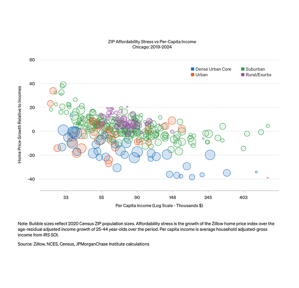
In the densely populated core areas of large cities like Chicago, however, home prices have risen by much less than the suburbs or exurbs—a legacy of pandemic-era shifts in demand. Notably, in the densest parts of major cities, including Chicago, home prices have risen by less than median incomes for 25−44-year-olds, an age group covering most first-time homebuyers. While younger workers have higher income growth on average, they are less likely to own a home, making them more exposed to rising real estate prices and interest rates. We use our data on within-person changes in income for this age group to illustrate dynamics of home affordability more precisely in the following plots.5
Figure 2 shows how Chicago neighborhoods recently fared by comparing home price changes to income growth.6 We examine these outcomes across four types of neighborhoods, ranging from high density neighborhoods in the urban core to low density rural and exurban neighborhoods. The solid bars in the figure show the growth of home prices across each neighborhood type. The dotted lines show the growth of the median take-home income of 25−44-year-olds in each area. Interest rates are an important additional factor shifting mortgage costs for all areas: the rise in mortgage rates over 2019-2024 would have significantly worsened total affordability relative to this home-price-only perspective. The figure shows that between 2019 and 2024, housing prices in Chicago grew the most in relatively low-density suburban areas, and markedly less in high population density urban areas. In contrast, incomes grew the most in dense urban areas, and slightly less in outlying less dense areas. This suggests that relative to 2019, affordability has worsened the most outside of the dense urban core of Chicago.
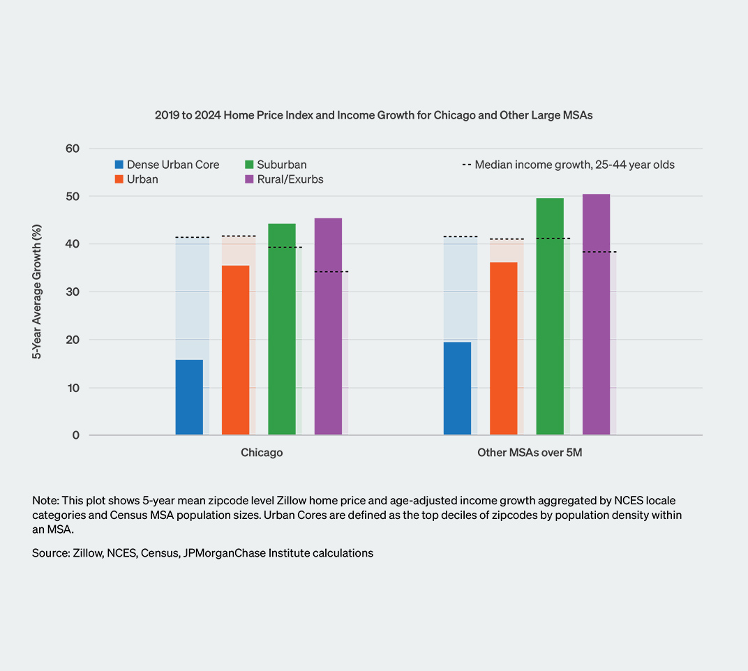
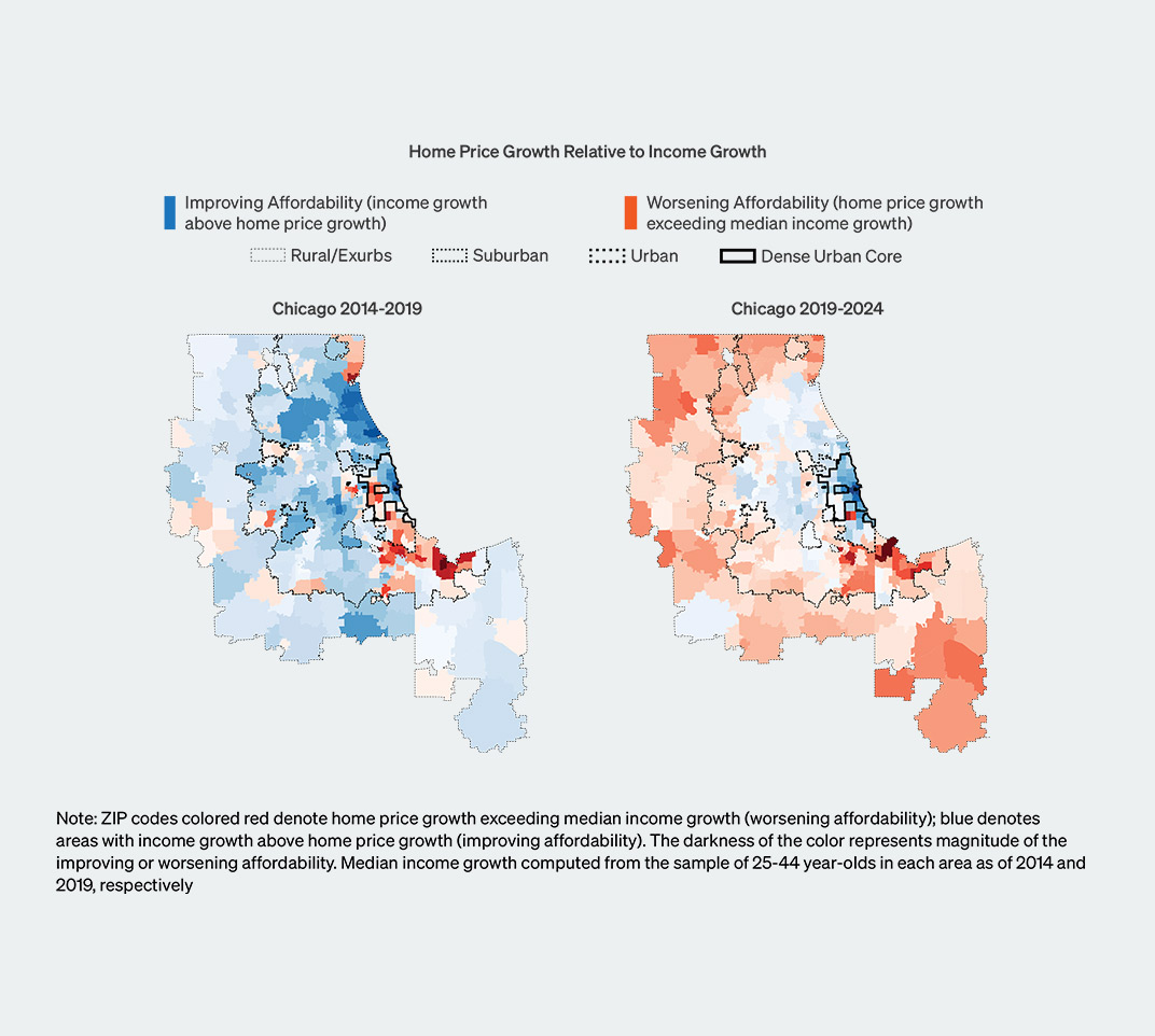
Figure 3 shows how this general pattern played out across specific neighborhoods in the Chicago metro area from 2019−2024, along the same view for 2014−2019 as a reference. The maps show the relative growth of home prices to incomes, where incomes outpaced home prices in blue neighborhoods, home prices outpaced incomes in red neighborhoods, and darker colors correspond to larger gaps between income and home price growth. In the years prior to the COVID pandemic, incomes generally grew faster than home prices in many neighborhoods, though home prices grew faster on the West and South sides of Chicago and some adjacent suburbs. From 2019−2024, home prices grew faster than incomes in many more neighborhoods, consistent with increased demand for housing outside of more urban areas.
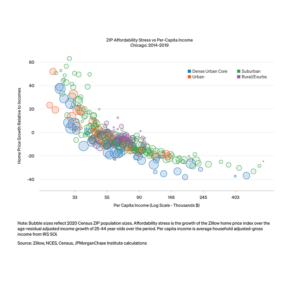
While changes in housing demand across neighborhoods of varying density play an important role in shaping changes in affordability, income remains a critical factor. To this end, Figure 4 shows how affordability varies both by neighborhood income and density.7 Within each neighborhood type, lower-income areas experienced poorer affordability dynamics: i.e., home prices rose relatively more than incomes. During the late 2010s, affordability worsened notably for areas of Chicago with lower-than-average incomes, highlighting the long-running challenges to homeownership for financially vulnerable Chicagoans. While dense urban areas experience relatively better outcomes on average than suburbs and exurbs across income levels between 2019 and 2024, income continues to play an important if more muted role.
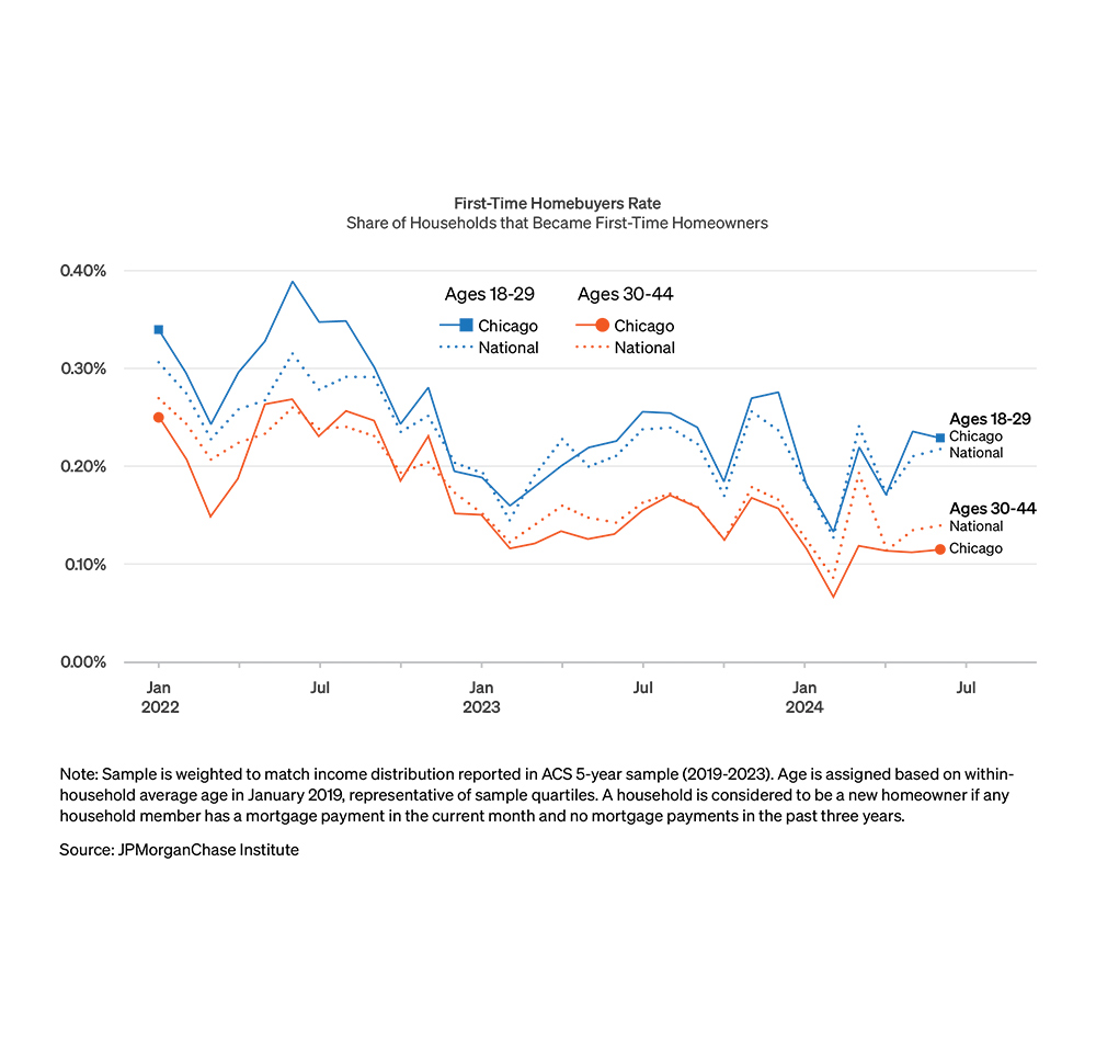
While the affordability of housing for future homeowners has worsened, fewer Chicago families are making the transition to homeownership. Traditionally, moving from renting to homeownership has been an important step for many families, facilitating the accumulation of wealth and, importantly, helping stabilize day-to-day finances. During inflationary periods, homeowner budgets with fixed-rate mortgages are sheltered from the full impact of inflation on their ability to purchase everyday goods and services. In recent years, the median age of first-time homebuyers rose to 38—an all-time high—according to a survey by the National Association of Realtors.8 Since 2000, the age of a first-time home purchase has consistently been older for Black and Hispanic homebuyers relative to White homebuyers, according to the CFPB.9
Given the key role that homeownership can play, it is critical to understand what share of families were able to make this transition in recent years. We explore these transitions by the new homeowner rate—the share of homeowners in a month who did not own a home in the recent past.10 Figure 5 shows the trajectory of this rate in Chicago and more broadly in the U.S. for potential homebuyers in two age groups. Across both groups, fewer homeowners were first-time homeowners in 2023 and 2024 than were in 2022, suggesting fewer families transitioned from renting to homeownership. Notably, the decline in the first-time homebuyer rate is sharpest for ages 30−44, the group that includes those most likely to make a first-time home purchase.
For renters and families seeking to become first-time homebuyers in Chicago, the rise in home prices and interest rates during recent years has led to financial challenges, including budgeting cutbacks for renters and reductions in the share of first-time homebuyers. Pandemic-era changes in housing demand in Chicago reflected nationwide shifts in prices that worsened affordability of the suburbs relative to downtown areas. Lower-income areas have faced higher price increases relative to incomes over the past decade, which presents a disproportionate challenge facing more financially vulnerable households.
This material is a product of JPMorgan Chase Institute and is provided to you solely for general information purposes. Unless otherwise specifically stated, any views or opinions expressed herein are solely those of the authors listed and may differ from the views and opinions expressed by J.P. Morgan Securities LLC (JPMS) Research Department or other departments or divisions of JPMorgan Chase & Co. or its affiliates. This material is not a product of the Research Department of JPMS. Information has been obtained from sources believed to be reliable, but JPMorgan Chase & Co. or its affiliates and/or subsidiaries (collectively J.P. Morgan) do not warrant its completeness or accuracy. Opinions and estimates constitute our judgment as of the date of this material and are subject to change without notice. No representation or warranty should be made with regard to any computations, graphs, tables, diagrams or commentary in this material, which is provided for illustration/reference purposes only. The data relied on for this report are based on past transactions and may not be indicative of future results. J.P. Morgan assumes no duty to update any information in this material in the event that such information changes. The opinion herein should not be construed as an individual recommendation for any particular client and is not intended as advice or recommendations of particular securities, financial instruments, or strategies for a particular client. This material does not constitute a solicitation or offer in any jurisdiction where such a solicitation is unlawful.
U.S. Census Bureau, U.S. Department of Commerce. "Tenure by Housing Costs as a Percentage of Household Income in the Past 12 Months." American Community Survey, ACS 5-Year Estimates Detailed Tables, Table B25106, 2023.
Increases in rent and overall goods from Bureau of Labor Statistics Consumer Price Index for All Urban Consumers: Rent of Primary Residence in Chicago-Naperville-Elgin, IL-IN-WI (CBSA) and Consumer Price Index for All Urban Consumers: All Items in Chicago-Naperville-Elgin, IL-IN-WI (CBSA), respectively. Wage increase from Quarterly Census of Employment and Wages - Average Weekly Wage in Private Total, all industries for All establishment sizes in Chicago-Naperville-Elgin, IL-IN MSA, NSA.
See the Atlanta Fed’s Home Ownership Affordability Monitor, national view.
See the Atlanta Fed’s Homeownership Affordability Monitor’s county level data.
Specifically, our view of within-person changes in income allows us to directly assess the income changes individual families face as a component of affordability. Views of affordability based on changes in income in an area can be distorted when the income composition of an area changes due to mobility—higher income families moving into an area increase median incomes, but they do not improve affordability for lower-income residents who remain in the area. We source ZIP code-level home price index (HPI) data for middle market homes from the Zillow Home Value Index.
For more details on this approach, see Ramani, Arjun and Nicholas Bloom, 2022. “The Donut Effect of COVID-19 on Cities,” NBER Working Paper Series
For each ZIP code, we use Internal Revenue Service Statistics of Income data to compute average incomes as the adjusted gross income of individuals divided by the number of tax filers in 2019. We use home price changes relative to median within-person income growth implied by Chase data for the affordability change and capture each ZIP code’s average income level using IRS data.
See Highlights From the Profile of Home Buyers and Sellers, National Association of Realtors, 2024.
See Market Snapshot: First-Time Homebuyers, CFPB, March 2020.
Specifically, we consider a homeowner a first-time homebuyer if they have no record of owning a home in the three years prior to the focal month. Our measure is intended to capture the rate of new homebuying activity scaled to the size of a local housing market.
Authors

Chris Wheat
President, JPMorganChase Institute

George Eckerd
Wealth and Markets Research Director, JPMorganChase Institute

Makada Henry-Nickie
Housing Finance Research Director, JPMorganChase Institute

Daniel M. Sullivan
Consumer Research Director, JPMorganChase Institute