
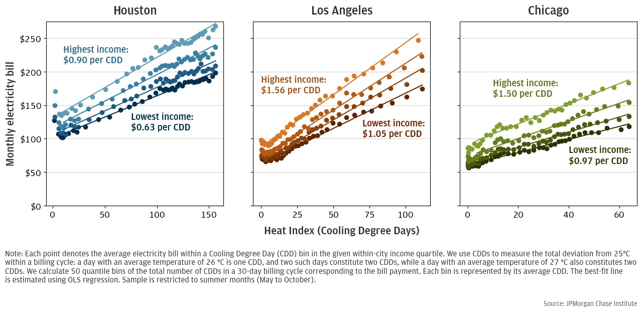
Figure 1: Electricity Payments vs Heat, Split by Income Quartile
Latest news

An Ohio-based company is protecting first responders around the world
With support from JPMorganChase, Fire-Dex is providing protective equipment to firefighters in 100 countries and all 50 states.
Learn moreLatest news

The consistency of health insurance coverage in small businesses: industry challenges and insights
Learn moreLatest news

Veteran’s Unconventional Path to Landing her Dream Job in Tech
U.S. Army Veteran Ashley Wigfall transitioned to a civilian role and charted her path to technologist through mentorship and skills training at the JPMorgan Chase tech hub in Plano, Texas.
Learn more
Research
July 18, 2024
Findings
Climate data show the world is growing hotter, and extreme heat is projected to accelerate under business-as-usual scenarios. By the end of the century, most of the United States is expected to see at least 50 days per year with a maximum temperature above 95 °F.1 The negative impacts of such extreme temperatures on health and economic outcomes have been extensively documented.2 Extreme heat is already estimated to cause about 1,300 premature deaths annually, and this is expected to grow to tens of thousands per year by the end of the century.3
When temperatures increase in summer months, budget-constrained households may be forced to choose between spending on air conditioning and spending on other things like food and clothing. Assessing the costs of cooling and the budget decisions households make in response to these costs can help policymakers target the mechanisms most likely to improve the welfare of those households most burdened by the challenges of hotter weather.
In this report, we use administrative banking data from three metro areas—Houston, Los Angeles, and Chicago—to measure how households manage their electricity bills and other spending when faced with hot weather. We find that low-income households primarily manage high electricity bills in hot months by using less air conditioning and enduring more heat. In particular:
These findings have important implications for how policymakers respond to new threats from extreme heat.
Combining our work with prior research on the mortality costs of heat exposure suggests that the health costs of under-cooling likely exceed the amount households save on their electricity bills.4 As such, the cost of a policy to reduce under-cooling by lower-income households may be less than the benefits to those households and society as a whole.
Our findings also suggest that policies to reduce inequality in heat exposure must account for the fact that under-cooling appears to be the main driver of inequality. When faced with the choice between reduced cooling and reduced consumption, households have shown that they prefer reduced cooling. As such, a policy that makes cooling cheaper relative to other consumption will probably be more successful at reducing the cooling gap than a policy that makes a household’s current choice between cooling and consumption more manageable. For example, a program that allows flexibility in electricity bill payment acts as a source of liquidity for the household, but there is no guarantee that the household will use this new liquidity to fund more cooling—they could instead use the additional liquidity to fund other consumption and keep their cooling spending constant.5 By contrast, low-income electricity discounts like those now implemented in California and Illinois could specifically correct under-cooling by making electricity cheaper relative to other goods.
To understand how much each hot day costs households, we begin by identifying electricity bill payments in bank transaction data. Our data are de-identified administrative banking data from Chase customers that include the day, amount, and counterparty of individual transactions. We restrict our sample to the two years prior to the COVID pandemic, 2018-2019, to avoid conflating pandemic-era economic dynamics with heat related spending. We further restrict our sample to customers who meet certain account usage criteria to ensure our data capture the majority of the customers’ financial behavior; these criteria are described in detail in the Appendix.
We focus on three large cities where we are able to distinguish between electricity and natural gas bill payments: Houston, Los Angeles, and Chicago. We then combine these bill payments with estimates of the amount of heat in the time period the bill covers.6 Following the literature on the social and economic effects of heat, we measure heat in cooling degree days (CDDs), which is a proxy for the amount of electricity needed to keep a building at a comfortable temperature during a given time period. Differences in CDDs correspond to differences in how much air conditioning is needed to keep a building at a safe and comfortable temperature.7
Figure 1 plots the relationship between temperature and electricity spending and heat for each income quartile via binned scatterplot.8 We see that that bill payments increase with heat for all income groups. Under the assumption that electricity use for other household appliances, like dishwashers and televisions, is not affected by temperature, we can interpret this relationship as households increasing air conditioning use as heat increases.
Figure 1: Electricity Payments vs Heat, Split by Income Quartile
We see from these plots that when the weather is hotter, lower-income households do not increase their air conditioning use as much as higher-income households. To quantify these differences and find the average cost of cooling per CDD, we estimate the slope of the best-fit line for each income group. We find that low-income households spend $0.63 per CDD in Houston, $0.97 in Chicago, and $1.05 per in Los Angeles, while high-income households spend $0.90, $1.50, and $1.56 respectively. Houston’s lower cost of cooling likely derives from its younger housing stock and higher penetration of central air conditioning systems.9 These adaptations are more cost-effective in Houston than relatively cooler cities like Chicago or Los Angeles because the city experiences more hot days over which to spread the large capital outlay. As heat increases, higher- efficiency cooling technologies may become more cost-effective in other cities, thus bringing down the cost of cooling to near the Texas benchmark.
If all income groups lived in houses that were exactly the same, we would interpret these differences in air conditioning use as differences in cooling intensity, i.e., achieving colder temperatures within the house. However, low-income families typically live in smaller houses, which could also lead to less A/C use because it is not as costly to cool smaller homes to a given temperature. To isolate the behavioral choice to use less air conditioning from these other factors, we estimate the slope of the best-fit line while controlling for house characteristics like number of rooms using data from the 2018 American Community Survey (ACS).10 We also control for differences in the level of electricity spending across income groups and house types independent of temperature. This yields a measure of the marginal electricity expenditure per CDD that is attributable to income (see Appendix for specification details).
Figure 2 presents our estimates of the differences in cooling intensity across income groups, controlling for differences in house size. We see that across all cities, marginal cooling expenditures increase with income, and being in the lowest-income group tends to reduce the marginal cooling expenditure by about 40 percent relative to the highest-income group.
Figure 2: Income-specific component of electricity spending per CDD controlling for number of rooms in house
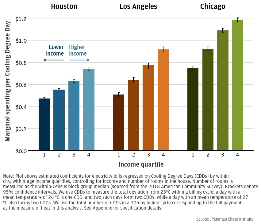
Underpayment by low-income households does not explain this gap. These coefficients only capture differences in spending that increase with heat as measured by CDDs. Any baseline differences in underpayment would be captured in the income-group controls. If the difference in underpayment across income groups widens as CDDs increase, that difference would be captured here. This could very well be the case in Houston where summer bills are significantly larger than winter bills. However, if the gap in underpayment decreases with CDDs, then our estimates here actually under-estimate the true gap in cooling intensity. At least for Illinois, that appears to be the case: Regulatory filings for Commonwealth Edison suggest that the difference in underpayment across income groups is actually lower in summer than it is in the fall.11
Means-tested electricity rates also do not explain this gap. While California’s CARE program12 provides low-income households with 30-35 percent discounts on their electricity bills, these programs did not exist in Illinois and Texas over the time period of the study.13
To confirm that other house characteristics are not driving the differences we see, we use data on house age and square footage taken from assessor data that is matched to customers with mortgages. However, restricting to the sample with a mortgage selects households with higher wealth, as shown in Tables A1 and A2. These households may also be more likely to have their income misclassified, i.e., the Chase account we observe is just one of many accounts the household uses. We control for house type with a combination of house age and house size and again compute the marginal expenditures per CDD by income. Figure 3 presents these results. We find that although standard errors are larger, low-income households still consume statistically-significantly less energy per CDD than high-income households.
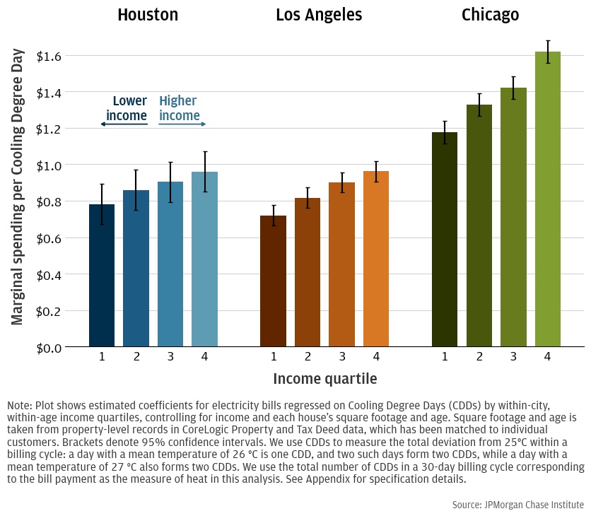
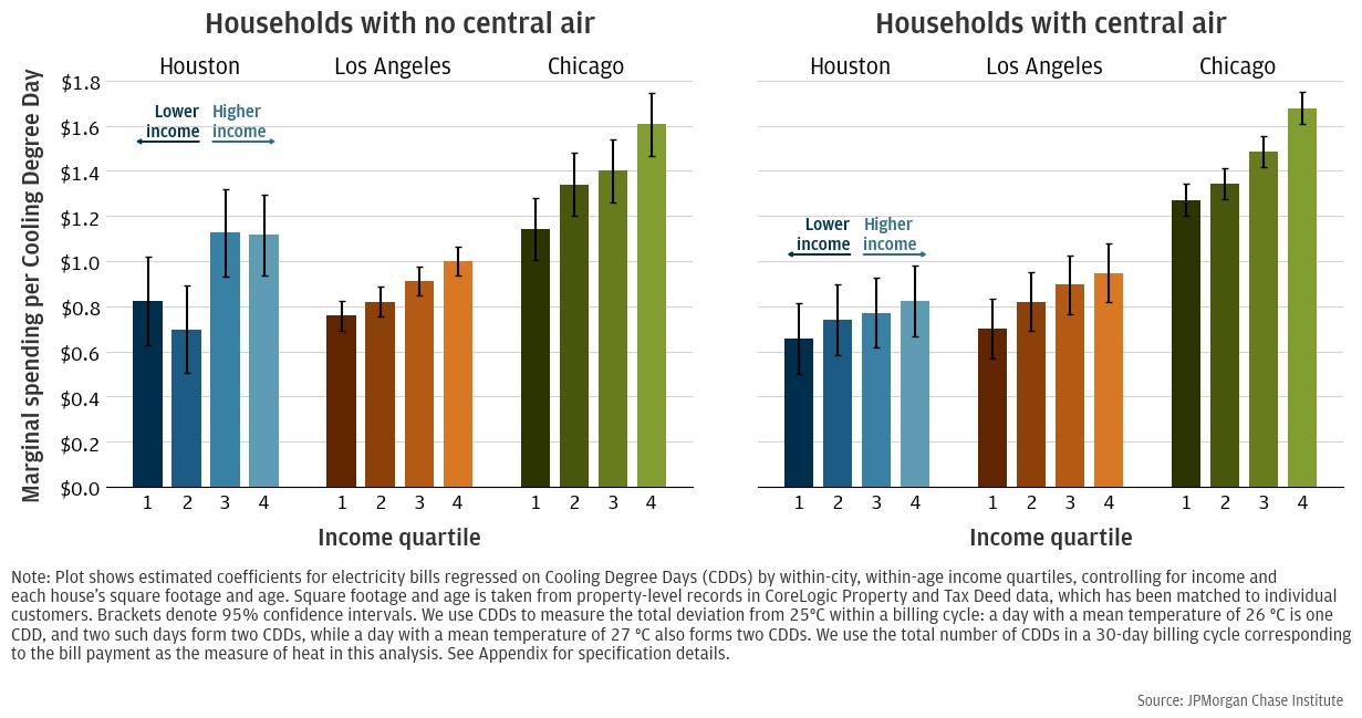
Therefore, we interpret these estimated differences in expenditures across income as differences in cooling intensity. A possible explanation for these differential effects across income is that lower-income households predominantly cool with window units, which allow them to cool only the rooms they occupy. However, differences persist across income even for households with central AC, ruling out this explanation (see Figure A3 in Appendix). We might also expect that low-income households are younger and have less medical need to cool; however, differences persist across income when we restrict to households older than 65 who are most in need of cooling (see Figure A2 in Appendix).14 Moreover, households are assigned to income quartiles based on their within-age income ranking, which further mitigates this concern.
These results suggest that lower-income households maintain higher indoor temperatures than higher-income households do. These differences in internal temperature could be further exacerbated by urban heat islands and poor insulation, which are more likely to affect low-income families (Berger et al. 2022).
High electricity bills have modest effects on most spending
While low-income households reduce their electricity bills by cooling less intensively, they nevertheless spend a significant amount on air conditioning and may still have tighter budgets in hot months. We investigate the extent to which high electricity spending causes households to reduce spending in other categories.
The relationship between energy spending and other consumption is complicated by a number of confounding factors—both observable and unobservable. To mitigate these confounds, we use a quasi-experimental research design to measure the relationship between electricity bill spending and other spending. Specifically, we use a two-stage least squares (2SLS) model where temperature during the bill cycle is an instrumental variable for spending around the time of bill payment.
A naïve analysis of the crowd-out effects of electricity spending might study how spending varies with temperature on a daily basis. However, hot weather also increases the disutility of going outdoors, and has been documented to suppress retail spending (Lee and Zheng 2023). Thus, if we observed suppressed spending on hot days it could be due to this effect rather than budgetary concerns. Similarly, the simple correlation between electricity bill payments and other spending across individuals and months might yield a positive relationship. For example, higher-income households likely consume more consumer goods and more electricity, and all kinds of households might change their consumption patterns on hot days. Even controlling for income and looking within a household, unobservable characteristics might complicate causal inference. It is impossible to control for all of these unobservables, so a quasi-experimental strategy is needed to make all-else-equal comparisons and credibly establish a causal link between electricity bill spending and other spending.
We estimate this relationship by using variation in temperature across households’ billing cycles and the different timing of household billing cycles, controlling for a household’s fixed characteristics, time-of-year effects, and other factors. This isolates the component of the electricity bill due to air conditioning demand and allows us to study the effect of the ensuing bill payment on spending. Paying an electricity bill could affect household spending both prior to the bill payment (e.g., after the household receives the bill but before payment is made) and afterwards (e.g., the household paid a large bill and is short on cash until its next pay day). Effects could be distributed over several weeks, such that a given week of spending could be affected by multiple bill payments. To account for this, we allow bill payments to affect spending up to 8 weeks before and 8 weeks after the payment.15
Figure 4 shows the estimated change in essential spending due to one additional dollar of electricity bill payments, where “essential” spending is spending on groceries, health care, and fuel. Time on the x-axis measures the relative number of weeks since a bill was paid. For example, the estimated effect on spending in Week -2 corresponds to two weeks before a bill is paid, Week 4 corresponds to the fourth week after the bill is paid, etc. Results are presented for each of our three case study cities.
Figure 4: Change in essential spending per $1 increase in bill amount in weeks before and after a payment is made
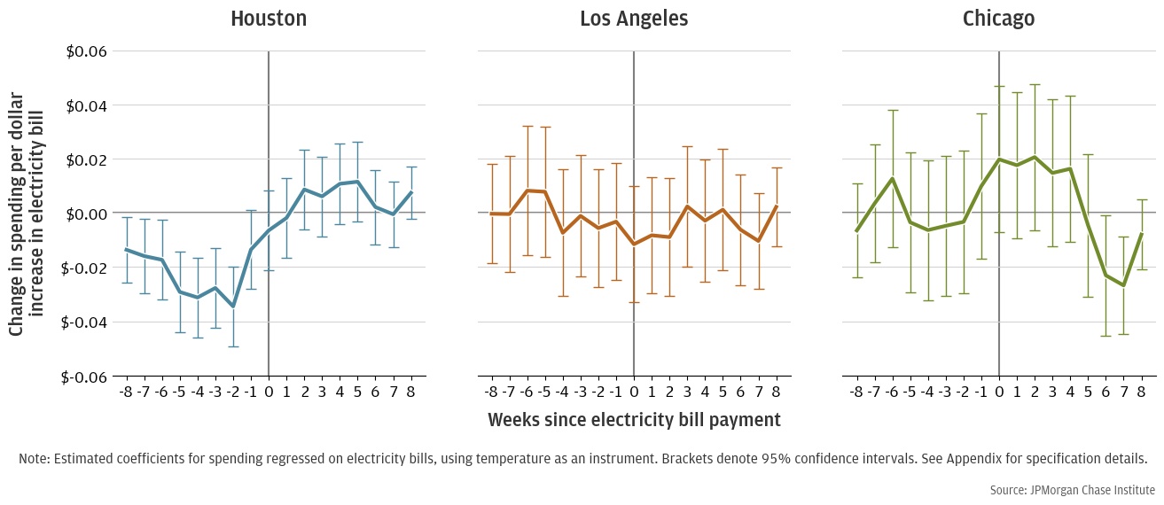
The results in Figure 4 are mixed. Spending on essential goods is depressed somewhat in Houston prior to the bill payment, with each week seeing between $0.014 and $0.03 less spending for a marginal dollar of electricity spending. However, spending partially rebounds after the bill payment. Together, these estimates suggest that that an additional dollar of electricity spending results in $0.05 of deferred spending and $0.14 of forgone spending in Houston. Using our estimates from the previous section, this suggests that an additional 95 °F day would result in $0.32-0.45 in deferred spending and $0.88-1.26 in forgone spending.16 However, the data in Los Angeles shows no spending response statistically different from zero. The response in Chicago is fairly noisy, with no marked pattern.
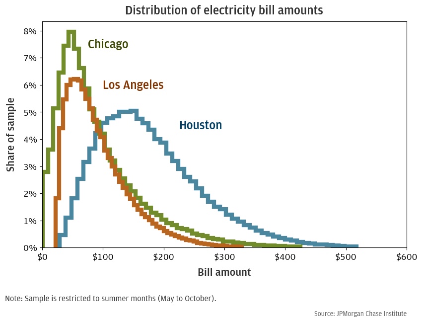
The marked response in Houston and lack of response in Los Angeles and Chicago may be driven by the fact that Houston is significantly hotter than the other cities and thus generates much larger electricity bills. Appendix Figure A1 plots the distribution of bill amounts in our three samples and shows that especially large bills are much more common in Houston. For example, the modal bill is about $50 in Los Angeles and Chicago and $150 in Houston, and a $200 bill is roughly 4 times more likely in Houston than in either of the other cities.
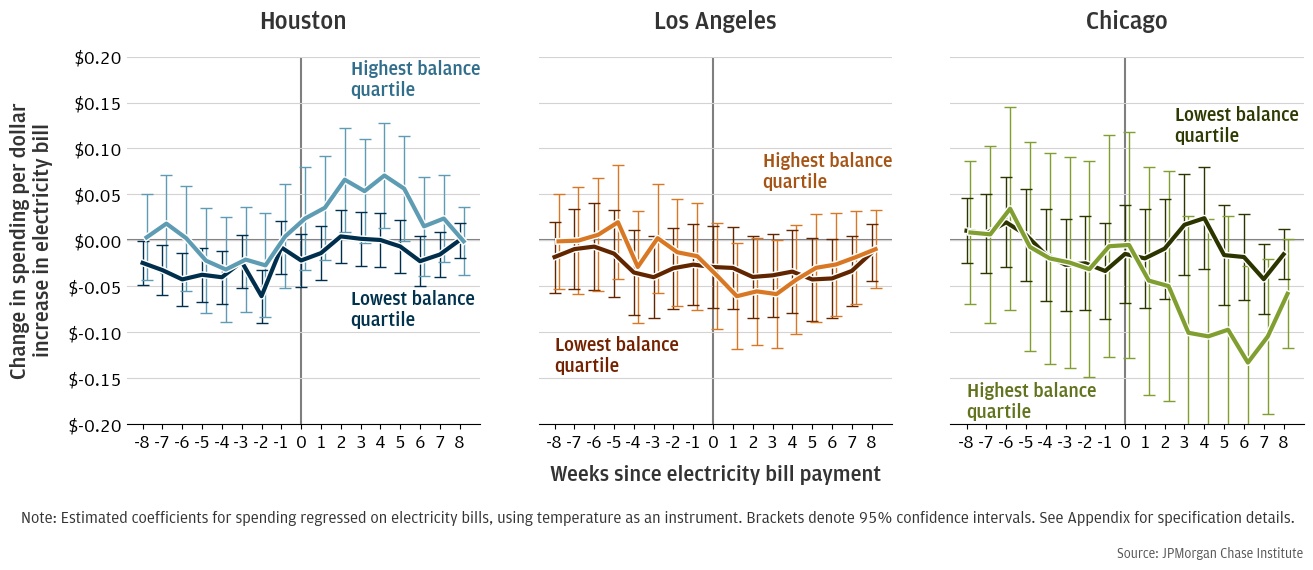
The extent that forgoing or deferring spending constitute real welfare losses might depend on who is changing their essential spending to make their electricity bill payments. In Figures 6 and 7, we estimate separate spending responses by household income and cash balances.
Figure 5: Change in essential spending per $1 increase in bill amount in weeks before and after a payment is made
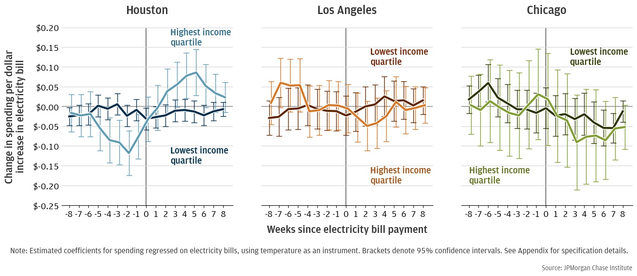
Figure 5 replicates the results presented in Figure 4 for households in the highest and lowest income quartiles. We again see a meaningful response in Houston, but little clear, statistically significant response in Los Angeles and Chicago. In Houston, low-income households may forgo some spending, but large standard errors make it difficult to confidently say more. By contrast, high-income households appear to significantly decrease spending. An additional dollar of electricity spending causes these households to decrease essential spending by roughly $0.45 across the 5 weeks before the bill is paid. However, much of that spending is made up after the bill is paid, and the total effect across all weeks is only -$0.15. This large response by high-income households is somewhat unintuitive, especially in contrast to the response seen among low-income households. We would expect high-income households to have more liquidity, which they could use to smooth consumption in the face of a surprisingly large bill. It is possible that even in essential spending categories like groceries, high-income households have a relatively low marginal utility of consumption and it is easy to reduce spending without significantly decreasing utility. That is, reducing grocery spending for high-income households might mean exchanging more expensive cuts of meat for cheaper foodstuffs while reduced grocery spending for low-income households might mean less food overall. It is also important to note that we only see a statistically meaningful response in Houston, where 95 degree days and $200-$300 bills are not uncommon.
In Figure 6, we split our sample based on each household’s cash balances—a proxy for household liquidity—and allow a separate spending response for each quartile. Low-balance households in Houston appear to forgo some spending in weeks -7 through -4, which generally corresponds to the weeks before the household receives the bill. In Los Angeles and Chicago, the estimates for high- and low-balance households are sufficiently noisy (that is, have large enough standard errors) that we cannot confidently distinguish between the behavior of low- and high-income households in those cities.
Figure 6: Change in essential spend per $1 increase in bill amounts in weeks before and after a payment is made
While deferred or forgone spending on essentials like groceries is of particular concern from a welfare perspective, effects on discretionary spending are also a concern, and we explore the effect on discretionary spending in Figure 7.17 The response in discretionary spending is similar to essential spending. In Houston, the decrease in spending before bill payment is a little more pronounced, but so is the rebound in spending after the bill is paid, and on net there is little forgone discretionary spending. In Los Angeles and Chicago, the response in discretionary spending is also similar to the response in essential spending: very noisy relative to Houston. There appears to be a decrease in spending in Los Angeles between weeks -4 and +1, but only the response in Week 0 is statistically different from zero, and it is difficult to draw strong conclusions about the extent of the spending response in Los Angeles. However, it is again notable that we find more marked responses in cities that tend to have more heat and higher electricity bills, with Houston having the largest bills, followed by Los Angeles.
Figure 7: Change in discretionary spend per $1 increase in bill amounts in weeks before and after a payment is made
Our analysis finds that low-income households primarily respond to high electricity bills during hot months by using less air conditioning than high-income households. If households are accurately accounting for all the costs of enduring more heat exposure, this does not necessarily motivate a policy response. However, policymakers may worry that market frictions or the low salience of the costs of heat exposure could mean that households are not optimally balancing the costs and benefits of enduring high heat.
How big are these potential frictions? Our estimates suggest that by cooling less intensively than high-income households, low-income households are saving between $2.70 and $4.40 in electricity costs on a 95 °F day.18 However, back-of-the-envelope estimates of the mortality cost from undercooling range between $6.88 and $8.29.19 This implies a cost-to-benefit ratio of 2.5 in Houston, 2.0 in Los Angeles, and 1.6 in Chicago. Other non-monetary effects of undercooling, like non-lethal health events and negative effects on children’s learning abilities, further increase the cost.20 , 21
What might be driving this gap? One possibility is that consumers are unaware of the health risks from undercooling, and information treatments advocating for air conditioning consumption could save lives. A corrective policy would alert vulnerable low-income households to the importance of cooling during times of high medical need. In this case, direct cash transfers would be an expensive way to correct the friction, because consumers would still underestimate health benefits and would still spend ”too much” of the benefit on other consumption.
Another possibility is that consumers are individually optimizing, but the marginal utility of other consumption is also high given their budget constraints. In other words, concrete necessities like food and shelter are prioritized over future health outcomes. In this circumstance, since the money saved is likely less than the social costs, social welfare would still be improved by helping these families increase cooling. A policy to correct this friction might subsidize air conditioning use in times of high medical need, for example by paying for a share of air conditioning use for low-income households on days with heat indexes above a certain threshold.
Another possible friction in this setting is liquidity constraints: low-income households might be aware of the health benefits of cooling and able to afford cooling over the long run, but liquidity constraints prevent them from borrowing against their future income to pay for a higher bill today. Our results suggest these liquidity constraints are not driving the behavior of most families. Most households do not significantly change their non-electricity spending in response to higher electricity bills. While our aggregate results in Houston show some rebound in spending after bill payment—a telltale sign of liquidity constraints—we do not see a rebound in spending among low-income and low-liquidity households. This suggests that policies like shutoff moratoria primarily assist households by avoiding health crises triggered by lack of energy during extreme weather events, rather than by providing liquidity.
A more fundamental friction could be the lower incentives renters have to invest in efficient cooling technology. Apart from subsidy programs, the easiest way to lower the per unit cost of air conditioning is investment spending to make cooling more efficient, such as improved insulation, new windows, or a heat pump. Low-income homeowners may find it difficult to make these investments because of the large upfront costs, and low-income renters are very unlikely to make these investments because the value of the capital investment will accrue to the landlord. A family would have to stay in the same rental unit for a very long time to recoup an investment on capital outlays like new windows or a heat pump, while a homeowner would be able to recover the value of these investments when selling their home.
Together, our findings suggest that reducing heat-related welfare inequality will require lowering the cost of air conditioning for low-income households.
Are current utility assistance programs structured to accomplish this? At a federal level, two major energy assistance programs are the Weatherization Assistance Program (WAP), which subsidizes energy efficiency investments for low-income households, and the Low-Income Home Energy Assistance Program (LIHEAP), which provides grants that are sent directly to beneficiaries’ energy providers. By improving energy efficiency, the WAP directly targets the cost of air conditioning. However, a large-scale randomized survey found that despite reducing participating households’ energy bills by 10-20%, the WAP is expensive and its overall rate of return is negative (Fowlie et al. 2018). LIHEAP, by contrast, mechanically provides a dollar-for-dollar cash transfer to households, but it does not necessarily increase the amount of cooling households consume. Currently, 51 state grant recipients provide heating assistance, but only 24 provide cooling assistance. Typical grants to assist with heating costs are about 600 dollars for an entire season.22 If these transfers are inframarginal, i.e., less than households would spend on heating anyway, then the program acts as a cash grant, not as an energy-specific subsidy. Thus, participating households are likely to spend “too much” of the cash grant on other consumption rather than increased energy use.
In addition to federal programs, some states have implemented low-income electricity discount rates (State of Connecticut 2022). While not specifically targeting air conditioning costs, these policies—unlike LIHEAP—change the cost of cooling relative to other goods and therefore have the potential to directly correct under-cooling. It is unclear how the effectiveness of this program compares to federal programs. Further work is needed to understand what market frictions operate in this setting and therefore what policy interventions are appropriate, but both the LIHEAP program and electricity price discounts are potential models for future policies attempting to increase cooling use.
Using de-identified account- and transaction-level administrative data on Chase account holders, we create three separate samples for the Core-Based Statistical Areas (CBSAs) of Houston, Los Angeles, and Chicago, consisting of customers with electricity payments from January 2018 to December 2019. We focus on Chicago, Los Angeles, and Houston due to their diverse temperature profiles, geography, and energy markets. The range in geography and markets results in differing bill amounts faced by households across the three cities (Figure A1). To ensure we are studying customers for whom we observe the majority of their financial activity, we require a minimum activity level of 5 transactions per month, along with a minimum take-home income of $12,000 in every year in the sample.
Figure A1: Bill amount density by CBSA
Next, we add temperature data to our samples. The Climate PRISM Group at Oregon State University provides daily minimum and maximum temperatures gridded to a 4km resolution. We define the average daily temperature as the average of reported minimum and maximum temperatures in a given day. We crosswalk grids to census block groups and take the spatial and population-weighted average of reported temperatures; the spatial weight is calculated as the percent of the census block group covered by a given PRISM grid cell, and the population weight is calculated as the percentage of the census block group’s population found in given block. At the end of this process, we have daily block group-level temperatures assigned to customers in our sample. We compute cooling degree days (CDDs), a measure of heat relative to a benchmark of 25 degrees Celsius (77 Fahrenheit). For days whose minimum temperature was above the 25 degree benchmark, CDDs for the day were calculated as difference between the day’s average temperature and the benchmark. For days whose minimum and maximum temperatures straddled the benchmark, we computed CDDs following the algorithm used by (Schlenker and Taylor 2021). To have a clear relationship between temperatures and bill amounts, we assign each household the 30-day temperature window up to 90 days prior to the payment date that has the highest correlation with their bill payments. Most customers have bills maximally correlated with temperatures in windows starting 45 to 60 days prior to the payment.
We impose further restrictions and create two separate samples for the above analysis: Sample 1 (CDDs’ effect on electricity bills) and Sample 2 (electricity bills’ effect on spending).
To study the effect of temperature on electricity bill spending, we restrict the core sample to households who have made at least 24 payments over the two-year period and with observed payments in January 2018 and December 2019. We do not impose timing restrictions, as a result we include households that miss and then make up payments. To account for housing characteristics in our analysis, we create two sub-samples using two different sources of housing data. Using ACS’s 5-year estimate published in 2019, we add median rooms reported at the census block-group level to our sample, resulting in 11,525, 14,365, and 23,381 customers in Houston, Los Angeles, and Chicago, respectively. We create a second sample aimed to capture more granular housing characteristics using CoreLogic Property and Tax Deed data: CoreLogic extracts real estate transaction data from publicly available deed records and county tax assessor files to cover almost all mortgages in the United States. We join CoreLogic data to our internal sample, resulting in approximately 3,221, 4,885, and 7,114 mortgage holders who primarily bank with Chase in Houston, Los Angeles, and Chicago, respectively. While this sample skews higher-income than ACS (see Tables A1 and A2), we are able to leverage household-level tax-reported living area square footage and year built for a more granular housing measure. leverage household-level tax-reported living area square footage and year built for a more granular housing measure.
Houston |
Los Angeles |
Chicago |
|
Electricity bill monthly payment |
154.08 |
100.46 |
90.96 |
(83.13) |
(65.35) |
(49.52) |
|
Monthly cooling degree days |
52.4 |
17.6 |
11.1 |
(55.3) |
(24.7) |
(16.8) |
|
N days < 45C |
1.4 |
0.2 |
13.9 |
(2.6) |
(1.5) |
(13.3) |
|
N days 45-55C |
3.8 |
3.4 |
3.5 |
(5.2) |
(5.5) |
(4.4) |
|
N days 55-65C |
5.7 |
12.0 |
3.5 |
(5.6) |
(9.7) |
(4.7) |
|
N days 65-75C |
5.7 |
11.0 |
6.0 |
(6.0) |
(9.3) |
(7.5) |
|
N days 75-85C |
10.4 |
4.1 |
3.9 |
(10.0) |
(7.2) |
(6.2) |
|
N days >85C |
3.9 |
0.2 |
0.2 |
(6.5) |
(1.1) |
(0.5) |
|
Median rooms in Census block-group |
6.1 |
5.4 |
5.9 |
(1.5) |
(1.2) |
(1.7) |
|
Annual income in 2018 (thousands) |
83.4 |
104.6 |
110.5 |
(103.5) |
(154.8) |
(213.3) |
|
Account owner age |
54.5 |
52.5 |
51.5 |
(16.2) |
(15.5) |
(16.0) |
|
Start of 30-day bill window (days before bill payment) |
54.8 |
45.0 |
52.2 |
(18.2) |
(14.8) |
(12.5) |
|
Correlation of bills and temp. in bill window |
0.7 |
0.5 |
0.5 |
(0.3) |
(0.3) |
(0.4) |
|
Number of customer-bills |
277531 |
345592 |
561717 |
Number of customers |
11525 |
14365 |
23381 |
Note: Standard deviations in parentheses. |
|
|
|
Houston |
Los Angeles |
Chicago |
|
Electricity bill monthly payment |
161.22 |
104.52 |
100.36 |
(88.39) |
(68.01) |
(48.60) |
|
Monthly cooling degree days |
52.3 |
18.1 |
11.3 |
(55.2) |
(25.4) |
(17.1) |
|
N days < 45C |
1.4 |
0.3 |
13.9 |
(2.7) |
(1.6) |
(13.3) |
|
N days 45-55C |
3.9 |
3.5 |
3.5 |
(5.2) |
(5.6) |
(4.4) |
|
N days 55-65C |
5.8 |
11.9 |
3.4 |
(5.6) |
(9.6) |
(4.7) |
|
N days 65-75C |
5.7 |
10.9 |
6.0 |
(6.0) |
(9.3) |
(7.5) |
|
N days 75-85C |
10.5 |
4.1 |
4.0 |
(10.0) |
(7.3) |
(6.2) |
|
N days >85C |
3.8 |
0.2 |
0.2 |
(6.4) |
(1.2) |
(0.5) |
|
Square feet of living space |
2251.5 |
1711.6 |
1860.6 |
(832.3) |
(663.1) |
(814.7) |
|
Year built (if recorded) |
1993.6 |
1969.0 |
1965.5 |
(18.8) |
(21.1) |
(30.0) |
|
Central AC |
1.0 |
0.4 |
0.7 |
(0.2) |
(0.5) |
(0.5) |
|
Annual income in 2018 (thousands) |
105.9 |
121.4 |
131.3 |
(100.7) |
(105.0) |
(145.6) |
|
Account owner age |
51.2 |
51.4 |
49.0 |
(13.3) |
(12.5) |
(12.3) |
|
Start of 30-day bill window (days before bill payment) |
55.1 |
44.7 |
52.2 |
(17.5) |
(14.2) |
(10.3) |
|
Correlation of bills and temp. in bill window |
0.7 |
0.5 |
0.6 |
(0.3) |
(0.3) |
(0.3) |
|
Number of customer-bills |
89949 |
138414 |
196356 |
Number of customers |
3221 |
4885 |
7114 |
Note: Standard deviations in parentheses. |
|
|
|
Using the core sample, we create a second sample to study the effect of higher electricity bills on spending. We restrict the core sample to households making regular bill payments, requiring a payment in each month from January 2018 to December 2019. We also require the correlation coefficient between bill amounts and temperature to be at least 0.4. We add additional household characteristics to our samples, including income, liquidity measures, and spending. We define take-home income as total household inflows minus transfers in a given year across all checking households associated with a household. To measure a household’s liquidity, we first calculate total daily balances across all associated Chase checking, savings, and money market accounts. We average daily balances across each calendar week, and assign households to liquidity quartiles based on a household’s median weekly balance in 2018. To study bill impacts on spending, we measure spending at the weekly level for each household based on their debit and credit card transactions. We define discretionary spending as spending on restaurants, personal and professional services, entertainment, retail, travel, home improvement, automobile repair, and other miscellaneous categories. We define “essential” spending as health-related expenditures, groceries (including discount stores), and fuel. We also require customers to have limited monthly credit card payments to non-Chase accounts: we restrict to customers for whom we account for more than 75% of credit card spending in observed credit card payments, ensuring we observe the majority of financial activity for customers included in our sample. This sample includes 4,374 customers in Houston, 3,187 customers in LA, and 7,522 customers in Chicago.
Houston |
Los Angeles |
Chicago |
|
Electricity bill monthly payment |
149.85 |
102.46 |
88.12 |
(81.29) |
(64.33) |
(46.10) |
|
N days < 45C |
1.4 |
0.4 |
13.8 |
(2.6) |
(1.8) |
(13.3) |
|
N days 45-55C |
3.9 |
3.8 |
3.6 |
(5.2) |
(5.8) |
(4.5) |
|
N days 55-65C |
5.7 |
11.6 |
3.5 |
(5.6) |
(9.2) |
(4.7) |
|
N days 65-75C |
5.7 |
10.6 |
6.0 |
(6.0) |
(8.9) |
(7.5) |
|
N days 75-85C |
10.4 |
4.5 |
4.0 |
(9.9) |
(7.6) |
(6.1) |
|
N days >85C |
4.0 |
0.3 |
0.2 |
(6.6) |
(1.3) |
(0.5) |
|
Annual income in 2018 (thousands) |
82.0 |
96.8 |
104.1 |
(79.7) |
(77.2) |
(103.7) |
|
Balance |
22798 |
17517 |
22198 |
(47488) |
(36851) |
(43670) |
|
Spend |
1545 |
1821 |
1895 |
(1406) |
(1501) |
(1655) |
|
Start of 30-day bill window (days before bill payment) |
58.6 |
52.2 |
62.3 |
(23.2) |
(13.8) |
(15.5) |
|
Correlation of bills and temp. in bill window |
0.7 |
0.6 |
0.6 |
(0.1) |
(0.1) |
(0.1) |
|
Number of customer-bills |
104950 |
76383 |
180540 |
Number of customers |
4374 |
3187 |
7522 |
Note: Standard deviations in parentheses. |
|
|
|
To control for housing characteristics and effectively compare cooling intensities across income levels, we regress bill amounts on income quartiles, binned home characteristics (home age and home size, depending on data source), and their interactions with cooling degree days (Equation 1).

Where bit is the electricity bill payment amount by household i in month-year t and CDDit is the number of cooling degree days. We assign each household an income bin j and housing characteristic bin l. When sourcing housing characteristics data from ACS, we assign each household to the median number of rooms reported across housing units in the household's census block group and assign housing characteristic bins using within-city quartiles. When using CoreLogic for housing characteristics, we interact within-city household-level square footage quartiles with housing age quartiles (in years). We allow the average level of energy bills to differ by a constant for each house type (γl) and for each income group (δj). We also allow the effect of temperature on energy bills to differ by each house type (αl). Our main coefficient of interest is βj, capturing the effect of an additional CDD on energy spending while being in a given income group, controlling for observed housing characteristics.
To isolate the causal effect of electricity bills on spending, we use the instrumental variables (IV) approach detailed in Equations 2 and 3.


where biwy is the paid bill amount and siwy is the amount of non-energy spending by household i in week-year wy. Tkc(i)y,w+r denotes the number of days in relative week r the average daily temperature (°F) across block group c(i) is in a given bin k, with k∈{(-∞,45),[45,55),[55,65),[65,75),[75,85),[85,+∞)}. Errors are clustered by household. We control for any payroll receipt t weeks before a given week (ρi,w+t), along with time- and houeshold-fixed effects. In the first stage regression (Equation 2), we measure the relationship between temperature and bill magnitudes and result with a predicted bill amount for each household-weekyear (b^kiy,w+r). In the second stage (Equation 2), we estimate the impact of predicted bill amounts in relative week r on the level of spending in a given category. category.
We interact temperature counts in relative weeks around the payment with whether a bill payment was made in the given week (1billiy,w+r) and use the resulting variable to instrument bill magnitude with temperature. Our instrument is strong and satisfies the exclusion restriction, adhering to the normal assumptions about the validity of our IV strategy. We test the hypothesis that the instruments are unrelated to the endogenous regressor with reported first-stage F-statistics below: all are > 10 the standard cutoff for weak instruments (resulting F-statistics are 24,648 in Houston, 9,929 in Los Angeles, and 33,814 in Chicago).
Figure A2: Marginal cost per CDD by income, split by age group (ACS)

Figure A3: Marginal cost per CDD by income, split by access to central air (CoreLogic)
Auffhammer, Maximilian. 2018. “Quantifying Economic Damages from Climate Change.” Journal of Economic Perspectives 32(4): 33-52.
Berger, Tania, Faiz Ahmed Chundeli, Rama Umesh Pandey, Minakshi Jain, Ayon Kumar Tarafdar, and Adinarayanane Ramamurthy. 2022. “Low-income residents’ strategies to cope with urban heat.” Land Use Policy 119:106192.
Braga, Alfésio, Antonella Zanobetti, and Joel Schwartz. 2002. “The effect of weather on respiratory and cardiovascular deaths in 12 U.S. cities.” Environmental Health Perspectives 110: 859-63.
Carleton, Tamma, Amir Jina, Michael Delgado, Michael Greenstone, Trevor Houser, Solomon Hsiang, Andrew Hultgren, Robert E Kopp, Kelly E McCusker, Ishan Nath, James Rising, Ashwin Rode, Hee Kwon Seo, Arvid Viaene, Jiacan Yuan, and Alice Tianbo Zhang. 2022. “Valuing the Global Mortality Consequences of Climate Change Accounting for Adaptation Costs and Benefits.” The Quarterly Journal of Economics 137(4): 2037–2105.
State of Connecticut. 2022. “PURA Establishes Low-Income Discount Rate for Qualifying Residential Electric Customers.” Public Utilities Regulatory Authority.
Crimmins, Allison, John Balbus, Janet L. Gamble, Charles B. Beard, Jesse E. Bell, Daniel Dodgen, Rebecca J. Eisen, Neal Fann, Michelle Hawkins, Stephanie C. Herring, Lesley Jantarasami, David M. Mills, Shubhayu Saha, Marcus C. Sarofim, Juli Trtanj, and Lewis Ziska. 2016. “The Impacts of Climate Change on Human Health in the United States: A Scientific Assessment.” U.S. Global Change Research Program: 312.
Dell, Melissa, Benjamin F. Jones, and Benjamin A. Olken. 2014. "What Do We Learn from the Weather? The New Climate-Economy Literature." Journal of Economic Literature, 52 (3): 740-98.
Derakhshan, Sahar, Trisha N. Bautista, Mari Bouwman, Liana Huang, Lily Lee, Jo Tarczynski, Ian Wahagheghe, Xinyi Zeng, and Travis Longcore. 2023. “Smartphone locations reveal patterns of cooling center use as a heat mitigation strategy.” Applied Geography 150:102821.
Deschênes, Olivier, and Michael Greenstone. 2011. "Climate Change, Mortality, and Adaptation: Evidence from Annual Fluctuations in Weather in the US." American Economic Journal: Applied Economics 3(4): 152-85.
Doremus, Jacqueline M., Irene Jacqz, and Sarah Johnston. 2022. “Sweating the energy bill: Extreme weather, poor households, and the energy spending gap.” Journal of Environmental Economics and Management 112:102609.
Fowlie, Meredith, Michael Greenstone, and Catherine Wolfram. 2018. "Do Energy Efficiency Investments Deliver? Evidence from the Weatherization Assistance Program." The Quarterly Journal of Economics 133 (3): 1597–1644.
Lee, Seunghoon, and Siqi Zheng. Forthcoming. “Extreme temperatures, adaptation capacity, and household retail consumption.” Journal of the Association of Environmental and Resource Economists.
Manson, Steven, Jonathan Schroeder, David Van Riper, Katherine Knowles, Tracy Kugler, Finn Roberts, and Steven Ruggles. American Community Survey 2018, 5-year estimates. IPUMS National Historical Geographic Information System: Version 18.0. Accessed November 15, 2023.
NOAA. Local Climatological Data. https://www.ncei.noaa.gov/metadata/geoportal/rest/metadata/item/gov.noaa.ncdc:C00128/html. Accessed January 25, 2023.
Park, R. Jisung, Joshua Goodman, Michael Hurwitz, and Jonathan Smith. 2020. “Heat and Learning.” American Economic Journal: Economic Policy 12(2): 306-39.
PRISM Climate Group, Oregon State University. https://prism.oregonstate.edu. Accessed January 25, 2023.
Schlenker, Wolfram, and Charles A. Taylor. 2021. “Market expectations of a warming climate.” Journal of Financial Economics 142(2): 627–640.
We thank Alfonso Zenteno, Annabel Jouard, and Oscar Cruz for their support. We are indebted to our internal partners and colleagues, who support delivery of our agenda in a myriad of ways and acknowledge their contributions to each and all releases.
We would like to acknowledge Jamie Dimon, CEO of JPMorgan Chase & Co., for his vision and leadership in establishing the Institute and enabling the ongoing research agenda. We remain deeply grateful to Peter Scher, Vice Chairman; Tim Berry, Head of Corporate Responsibility; Heather Higginbottom, Head of Research, Policy, and Insights and others across the firm for the resources and support to pioneer a new approach to contribute to global economic analysis and insight
This material is a product of JPMorgan Chase Institute and is provided to you solely for general information purposes. Unless otherwise specifically stated, any views or opinions expressed herein are solely those of the authors listed and may differ from the views and opinions expressed by J.P. Morgan Securities LLC (JPMS) Research Department or other departments or divisions of JPMorgan Chase & Co. or its affiliates. This material is not a product of the Research Department of JPMS. Information has been obtained from sources believed to be reliable, but JPMorgan Chase & Co. or its affiliates and/or subsidiaries (collectively J.P. Morgan) do not warrant its completeness or accuracy. Opinions and estimates constitute our judgment as of the date of this material and are subject to change without notice. No representation or warranty should be made with regard to any computations, graphs, tables, diagrams or commentary in this material, which is provided for illustration/reference purposes only. The data relied on for this report are based on past transactions and may not be indicative of future results. J.P. Morgan assumes no duty to update any information in this material in the event that such information changes. The opinion herein should not be construed as an individual recommendation for any particular client and is not intended as advice or recommendations of particular securities, financial instruments, or strategies for a particular client. This material does not constitute a solicitation or offer in any jurisdiction where such a solicitation is unlawful.
Footnotes
NOAA (2023).
See, for example, Deschenes and Greenstone (2011) and Carleton et al. (2022) for a discussion of mortality costs, and Auffhammer (2018) for a discussion of the wider costs of extreme heat.
Sarofim (2016).
See Implications section below for a full discussion.
Previous studies have tried to measure differences in energy and other-good consumption between low- and high-income households. One recent study using data from the Consumer Expenditure Survey finds that while hot weather increases electricity spending for high-income households, electricity spending in low-income households is unaffected (Doremus et al. 2022). At the same time, the study finds low-income households reduce their food spending in hot months while high-income households do not. However, coarse measurements of temperature and the aggregation of data to the monthly level may obscure important patterns, leading to under- or over-estimates of consumption gaps across income.
Customers may pay their bills immediately upon receipt, the day they are due, or anywhere in between. There may also be a delay between the time period covered by the bill and when a customer receives the bill. Therefore, the temperature that contributes to a given electricity bill may be from the 0-30 days preceding the bill payment; or it could be as many as 60-90 days ago. To establish the most relevant measure, for each customer we find the 30-day window that exhibits the highest correlation with bill payments. For example, one customer’s window might be 25-55 days prior to the bill. We then compute the number of CDDs over that 30-day window for every bill payment. (See appendix for more details on sample construction and CDD calculations).
Cooling degree days (CDDs) measure the total deviation from a benchmark “comfortable” temperature during a time period. For a benchmark of 25 °C, a day with an average temperature of 26 °C is one CDD, and two of those days constitute two CDDs, while a day with an the average temperature of 27 °C also constitutes two CDDs. The total CDDs in a time period is the sum of the CDDs for each day in that time period. In this study, we use a benchmark of 25 °C following the practice of other researchers, based on evidence which suggests that cognitive and health effects of excessive heat are concentrated above 25 °C (Dell, Jones, and Olken 2014). Lee et al. (2016) similarly find that in the Southeastern United States, higher mortality from heat begins at a threshold of 28 °C. Braga et al. (2002) find a lower threshold of 20-25 °C for colder locations. Carleton et al. (2022) likewise find that for elderly individuals in cold countries, temperature-related mortality begins to increase at 25 °C, while in hotter countries the threshold is closer to 30 °C. A threshold of 25 °C therefore accommodates the range of climates in our study areas.
In a binned scatterplot, we split all observed bill payments in each city into 40 different heat (CDD) bins and then compute the average bill payment and average number of CDDs for the bills in each bin.
According to 2019 American Community Survey, the median year of construction in Houston is 1978, versus 1949 and 1962 in Chicago and LA. 99% of households in Houston have central air, compared to 75% in Chicago and 81% in Los Angeles (American Housing Survey 2019).
We retrieve home size data from the 2018 American Community Survey and join block group-level median room counts to our samples. To reduce noise in our measurements, we further require customers to have made 24 payments between January 2018 and December 2019, with payments observed in the first and last months in the panel.
Filings for November 2021 (reflecting October 2021 activity) show that 14 percent of “residential low-income” customers are more than 30 days past due while 6.6 percent of non-low income customers are past due. For September (reflecting August behavior), these rates were 8.8 percent and 6.2 percent, respectively. Filing data can be found at
https://www.icc.illinois.gov/home/chief-clerk-office/filings/list?sd=637698528000000000&dts=365&ft=2&dt=240&ddt=10128
Illinois decided at the end of 2022 to offer discounted electric rates to low-income households: https://www.thetelegraph.com/news/article/Illinois-utilities-must-offer-discounted-rates-to-17674349.php
These results on central air conditioning and customer age use data on house size (number of rooms) from the ACS. If we use the more detailed housing characteristic data from CoreLogic (and thus restrict our sample to homeowners), the differences across income groups are not always statistically significant when splitting by central air conditioning and customer age. However, because restricting our sample to homeowners makes us less confident in our ability to identify low-income households, we prefer the regressions using ACS data and report them here.
A household’s billing cycle is determined by calculating the 30-day window where temperature is most correlated with bill amount (e.g., 20-50 days before bill payment). For this analysis, we also restrict our sample to households making regular bill payments —approximately one in each month of our sample period—although our findings are very similar when allowing for missed (and made up) payments. See Appendix for the full details of our methodology.
From Figure 1 we see that low-income households spend $0.63 per CDD and high-income households spend $0.90. Here we estimate $0.05 in deferred spending per $1 in electricity bill. A 95 °F constitutes 10 CDDs, so $0.63 in bill per CDD × 10 CDDs × $0.05 deferred spending per $1 of bill = $0.32 in deferred spending due to a 95 °F day.
We define discretionary spending as spending on restaurants, personal and professional services, entertainment, retail, travel, home improvement, automobile repair, and other miscellaneous categories. See Appendix for more details.
Based on the estimates in Figure 2, eliminating the inequality of electricity spending per CDD would require our lowest-income households to spend an extra $0.27 per CDD in Houston, $0.41 in Los Angeles, and $0.44 in Chicago. For a 95 °F day, which constitutes 10 CDDs, this would be an extra $2.70, $4.10, and $4.40, respectively.
We suppose that the achieved indoor temperature is linear with intensity of air conditioner use, so, e.g., 35 percent less cooling on a 95 °F day with a target temperature of 77 °F results in an indoor temperature of 83.3 °F. Next, we take estimates of heat-related mortality from Deschenes and Greenstone (2011) of 0.33 per 100,000 for an 84 °F day and 0.94 per 100,000 for a 95 °F day. Finally, we use the standard value of a statistical life (VSL) used by EPA, deflated to 2019 dollars, of $9.4 million. Discussion of EPA’s VSL can be found here: https://www.epa.gov/environmental-economics/mortality-risk-valuation
See Park et al. (2020) for a discussion of how higher heat slows children’s learning.
While low-income households may partially offset less-intensive home cooling with visits to cooling centers, this behavior likely does not explain much of our estimates. Derakhshan et al. (2023) find using mobile phone location pings that 12% of their sample visits an informal cooling center (e.g. shopping mall) on a typical summer day, while 15% visits on a hot day. Thus, only 3% of the population, or at maximum 12% of the lowest-income group, might be shifting to cooling centers as a substitute for at-home cooling for part of the day.
Authors

Chris Wheat
President, JPMorganChase Institute

Daniel M. Sullivan
Consumer Research Director, JPMorganChase Institute

Alexandra Lefevre
Consumer Research Vice President, JPMorganChase Institute

Abigail Ostriker
JPMorganChase Institute Academic Fellow