
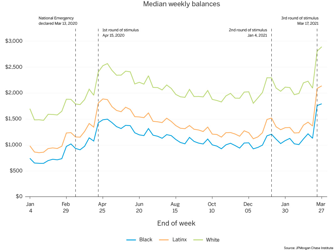
Figure 1: Median checking account balances are much higher for White families than for Latinx or Black families, though all follow similar patterns between January 2020 and February 2021.
Source: JPMorgan Chase Institute
Latest news

An Ohio-based company is protecting first responders around the world
With support from JPMorganChase, Fire-Dex is providing protective equipment to firefighters in 100 countries and all 50 states.
Learn moreLatest news

The consistency of health insurance coverage in small businesses: industry challenges and insights
Learn moreLatest news

Veteran’s Unconventional Path to Landing her Dream Job in Tech
U.S. Army Veteran Ashley Wigfall transitioned to a civilian role and charted her path to technologist through mentorship and skills training at the JPMorgan Chase tech hub in Plano, Texas.
Learn more
Findings
As the COVID-19 pandemic progressed, it became clear that its effects were not evenly distributed. In particular, the pandemic has taken a higher toll on communities of color, as hospitalization and death rates have been significantly higher for those groups (CDC 2021). These differential impacts are thought to be the result of differential exposure—including the overrepresentation of workers of color in essential-worker positions—as well as barriers to accessing healthcare. This raises questions about differential financial impacts of the pandemic.
Previous JPMorgan Chase Institute research has demonstrated racial gaps in financial outcomes (Farrell et al. 2020). In particular, we observe large racial differences not only in income, but also in liquid assets, which play a key role during times of economic uncertainty and disruption. In particular, Black families had just 32 cents in liquid assets for every dollar held by White families, and families with fewer liquid assets exhibited larger spending cuts after job loss.
Given these factors, the COVID-19 pandemic could result in further exacerbation of racial disparities in financial outcomes. While job losses were more concentrated among Black and Latinx workers, the financial impacts may have been offset by several policies that increased public supports: the March 2020 Coronavirus Aid, Relief, and Economic Security (CARES) Act, the December 2020 Consolidated Appropriations Act, and the January 2021 American Rescue Plan. With our unique lens of high-frequency, family-level financial data, the JPMorgan Chase Institute is well positioned to assess the impacts of these changes and further our understanding of financial disparities by race.
We use administrative banking data paired with self-reported race information to study racial gaps in families’ income, consumption, and liquid assets, and the response of each to the COVID-19 pandemic. Our data asset matches administrative banking data with 2018 voter registration data from three states—Florida, Georgia, and Louisiana—in which Chase branches existed in 2018 and voter registration records contain self-reported race. This data asset allows us to observe self-reported race alongside other demographic attributes1 and financial outcomes. We study liquid assets via trends in checking account balances by race and income groups, assessing changes in values and distributions during the pandemic. Likewise, we leverage debit card and checking account transactions to trace income and spending over time.
Consistent with prior research on liquid balances during the COVID pandemic (see Greig et al. 2021; and JPMorgan Chase Institute 2021 for most recent data), we observe increases in account balances for all race groups. Black families have lower starting balances than Latinx or White families and see the smallest balance increases in dollar terms during the pandemic – trends that hold even after accounting for income differences. Within each race group, women have lower account balances and depleted their balance gains more quickly than men. Balance changes throughout the pandemic are due to combined changes in account inflows and outflows, and we observe that Black and Latinx families experience larger increases in both total income and rate of receiving unemployment insurance (UI), relative to White families; Latinx families drop their everyday spending the most at the onset of the pandemic, and also consistently transfer money out of their accounts more frequently than Black or White families.
In summary, this research underscores that pandemic-based financial need was not evenly distributed by race. Public data on unemployment show an immediate and much larger spike in unemployment among Black workers than White workers in April 2020 and a slower subsequent recovery in employment, a result echoed in our observations of unemployment insurance by race. We also show that pandemic-related government supports were progressive in that they delivered cash to low-liquidity families, disproportionately boosting the cash balances of Black and Latinx families. These financial supports enabled families to continue their everyday spending, particularly for Black families. Finally, Black and Latinx families’ balances depleted faster than White families’. This signals the critical, but also temporary, nature of those government supports. This may also indicate that families of color faced circumstances that made it more difficult to maintain cash buffers, underscoring the relative precarity of their financial positions should they experience more prolonged unemployment.
As noted above, the race data that we rely on for this research is sourced from voter registration records for Florida, Georgia, and Louisiana. First, a note on race categories. The voter registration forms in these states ask respondents if they identify as White, Black, Hispanic, Asian, American Indian, or other. The use of a single question where respondents select one option means that we are unable to separately analyze race and Hispanicity (e.g. we cannot distinguish Hispanic individuals who identify as White from Hispanic individuals who identify as Black). For this reason, we use the word “race” as a shorthand to describe responses to the question on the voter registration form, acknowledging that many people consider Hispanic identity an ethnic category and not a racial group. Furthermore, the voter registration data offers the choice “Hispanic,” but not “Chicana/Chicano,” “Cuban,” “Mexican,” or other choices that voters might otherwise use to self-identify. We use the term “Latinx” in this report to refer to the group of respondents who chose the “Hispanic” category, acknowledging that there is substantial variation in the way people choose to self-identify.
To assess what our sample looks like relative to the general U.S. population, the Institute’s prior report on Racial Gaps in Financial Outcomes explored this question in depth. We found that our sample disproportionately represents Black and Latinx households, relative to both the nation and the population of registered voters in these three states. This overrepresentation is due in large part to the fact that Chase’s customer base within these three states is disproportionately concentrated in Florida and in urban areas, where Black and Latinx families are overrepresented. In addition, we slightly oversample female-headed households for Black and Latinx families.
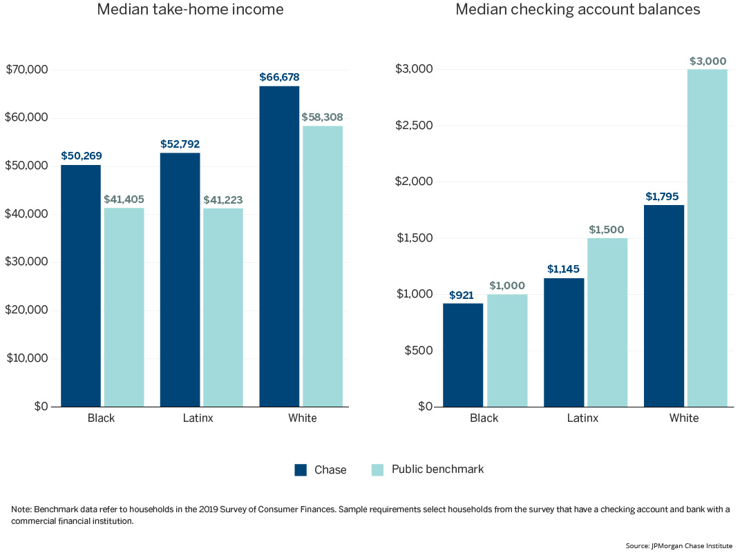
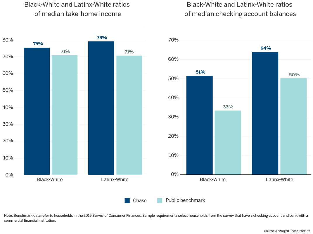
More broadly, we assess representativeness of our sample to understand whether it offers a reliable window into levels and differences in financial outcomes among Black, Latinx and White families. Using the 2019 Survey of Consumer Finances2 (SCF) as a benchmark, we compare our sample to the broader population of families based on two financial outcomes: income and checking account balances. See Appendix Figures A1 and A2 for results. Relative to the U.S. population at large, the families in our sample have higher income, with median 2019 total income $8,000 to $10,000 higher for our sample than the SCF, for each race group. This could be partially driven by our use of total income—not just labor earnings from employment income—as well as the overrepresentation of large urban areas in our data. Because these income differences are present for each race, the ratio of income for families of color3 relative to White families is less impacted, though still slightly higher for our sample than in the SCF: 75 percent for the Black-White income ratio (vs. 71 percent in the SCF data), and 79 percent for the Latinx-White ratio (compared with 71 percent in the SCF). So we somewhat overestimate the financial position of Black and Latinx families relative to White families, in terms of income.
The checking account balances picture differs more. Median checking account balances are comparable between our sample and the SCF for Black families, but 24 percent lower for Latinx families and 40 percent lower for White families. This means that, relative to national benchmarks, we overstate the Latinx-White balance ratio (64 percent vs. 50 percent from SCF) and substantially overstate the Black-White ratio (51 percent vs. 33 percent from SCF). Therefore, race-based differences in income and cash balances in this report may represent a best-case scenario, likely understating financial differences between White families and their Black and Latinx counterparts.
As previous Institute research has shown (Farrell et al. 2020), we see again that White families have higher liquid balances than Latinx or Black families. In January of 2020, for every dollar held by White families, Black families had just 44 cents and Latinx families 58 cents. Balance trajectories during the pandemic mirror our previous findings (Greig et al. 2021), with similar patterns exhibited by each race group: median balances began rising in March, peaked in April 2020 following the disbursement of the first stimulus payment, and then fell slowly throughout the remainder of the year, before peaking again in January and March 2021 with the second and third stimulus payments.
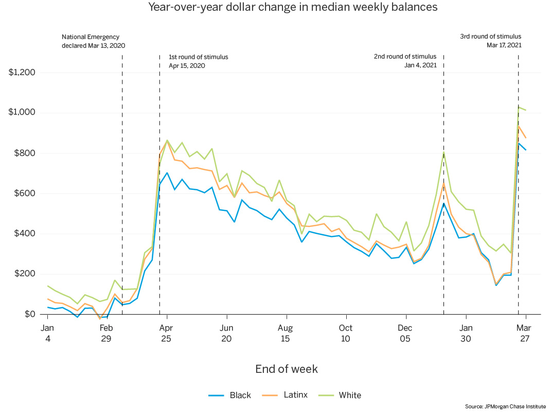
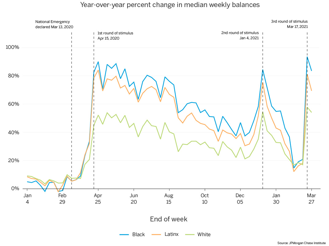
Despite similar balance trajectories, median balances increased more for White and Latinx families on a year-over-year basis than for Black families. Peak balances following the first round of stimulus were elevated roughly $860 relative to 2019 balances for White and Latinx families, compared with $700 for Black families (Figure 2). Despite experiencing the smallest dollar increases, lower starting balances mean that Black families experienced the largest year-over-year percent increases in balances: following the first stimulus disbursement in April, median balances for Black families were elevated 90 percent relative to 2019, closely followed by 84 percent for Latinx families (Figure 3). Due to significantly higher balance levels, White families’ balances were elevated only 52 percent relative to 2019, despite experiencing similar dollar increases as Latinx families. In both dollar and percent terms, year-over-year balance gains depleted slowly throughout the remainder of 2020. This gradual depletion, however, was faster for Black and Latinx families. By December 2020, the 30-plus percentage point gap in year-over-year balance growth between White families and families of color had narrowed to less than 16 percentage points.
For each race group, year-over-year changes after the second and third stimulus payments—in January and March 2021–reached peaks of similar magnitude as the balance changes following the first payment. However, the gains from the second stimulus payment depleted much more quickly than those from the first stimulus, again at a faster pace for Black and Latinx families, narrowing the gap in year-over-year balance growth between them and their White counterparts by the end of February.
Figure 1: Median checking account balances are much higher for White families than for Latinx or Black families, though all follow similar patterns between January 2020 and February 2021.
Source: JPMorgan Chase Institute
Figure 2: White and Latinx families experienced larger year-over-year balance increases than Black families following each stimulus payment.
Source: JPMorgan Chase Institute
Figure 3: On a year-over-year percent change basis, Black and Latinx families experienced the largest balance growth following each stimulus payment.
Source: JPMorgan Chase Institute
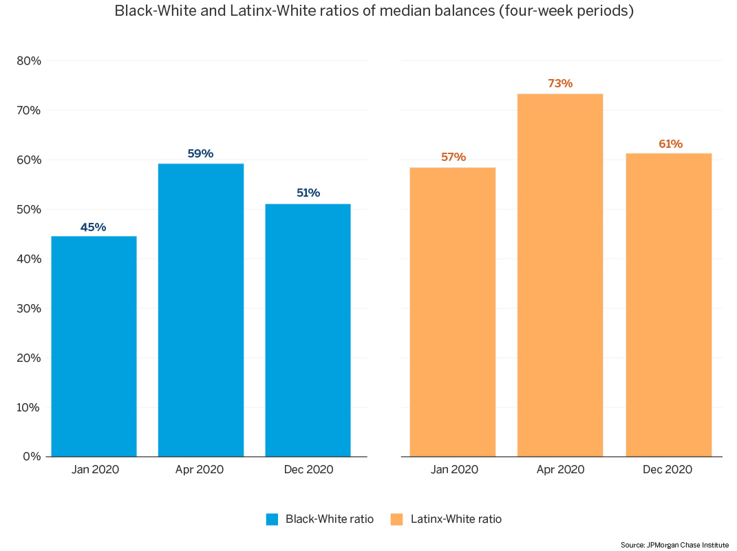
To put those different trajectories into perspective, consider the ratio of Black or Latinx families’ median balances to White families’ median balances. In Figure 4, we show these ratios at three key points in time: the first four weeks of 2020, the four weeks following the first stimulus payment in April 2020, and the last four weeks of 2020. Balance ratios increased 14 to 16 percentage points for Black and Latinx families at the post-EIP balance peak in April 20204. While still nowhere near parity with their White counterparts, higher balance ratios indicate lower balance gaps with respect to White families, and this change represented a narrowing of the racial gap in balances. However, by the end of 2020, the racial gap had begun to increase, and balance ratios were on their way back to pre-EIP levels. This result is consistent with the above, demonstrating that Black and Latinx families’ balances depleted faster than White families’ in the months following the first stimulus payment.
Figure 4: Black/White and Latinx/White balance ratios increased by roughly 10 percentage points at the post-EIP balance peak, but were on their way back to pre-EIP levels by December 2020.
Source: JPMorgan Chase Institute
As we and others have documented, COVID disproportionately impacted low-income families, with the greatest job losses occurring in lower-paid jobs such as non-essential services, retail, and hospitality. Given these differential impacts, do the above differences represent race effects, or are they primarily the result of White families having higher income? To assess this question, we separate our balance results by income quartile. Racial gaps in cash balances narrow when we compare families within income groups, but two notable findings emerge. First, regardless of race, low-income families experienced a faster depletion of their cash balances than high-income families. And second, even within income groups, Black and Latinx families’ lower balance starting points resulted in larger percent increases in balances with each round of stimulus, but they also experienced the fastest depletion of those gains. Put simply, the relative cash boost from each round of stimulus was larger but more short-lived among low-income Black and Latinx families.
Figure 5a: For the lowest income quartile, race differences in balance trends remain, though the White-Latinx gap in levels narrows slightly.
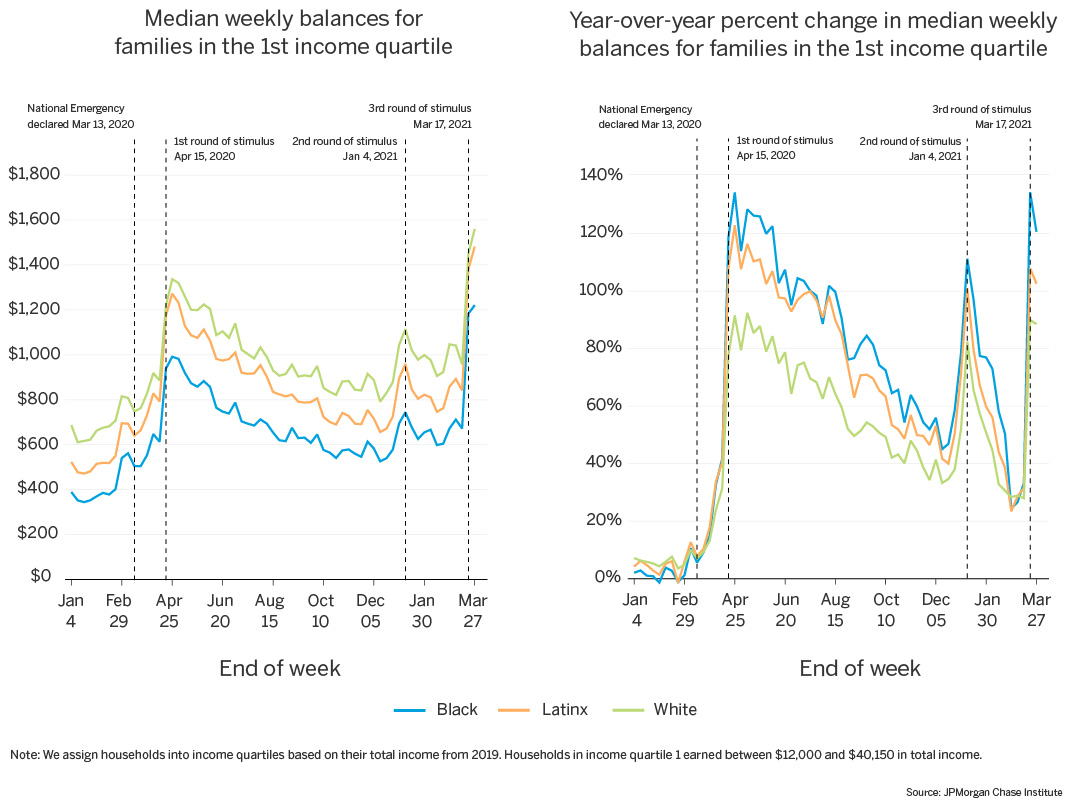
Source: JPMorgan Chase Institute
Figure 5b: For the highest income quartile, race differences in balance trends remain, though gaps in year-over-year percent change narrow.
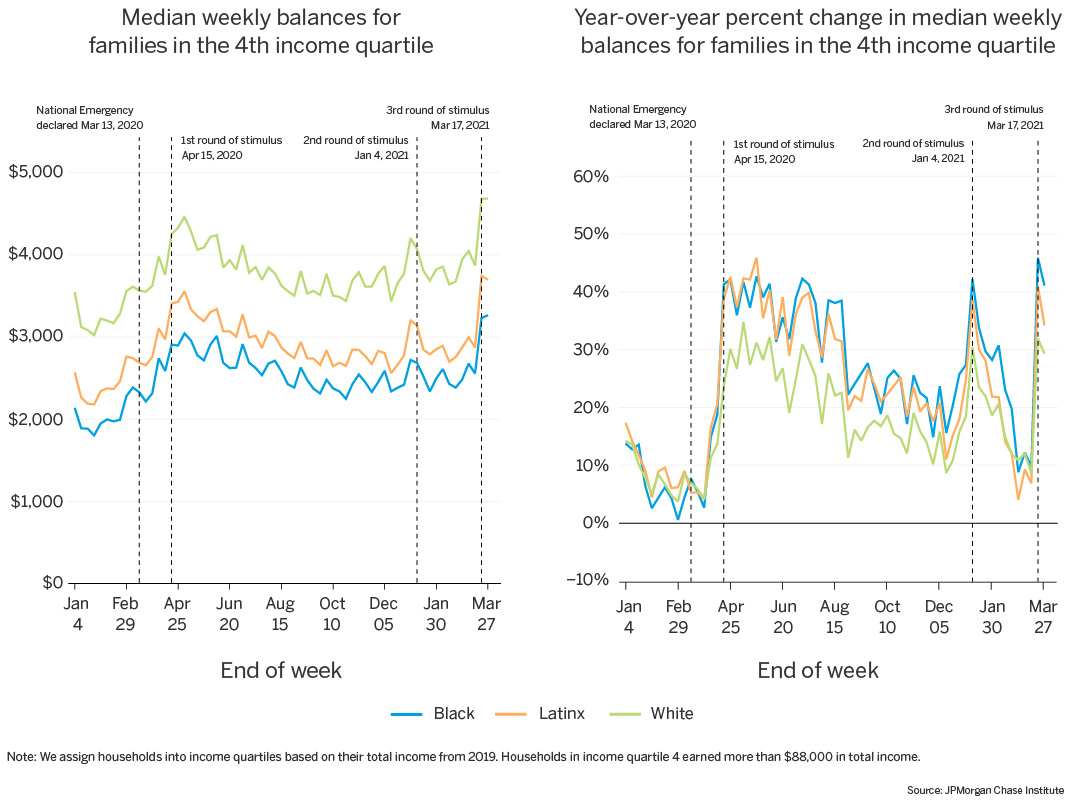
Source: JPMorgan Chase Institute
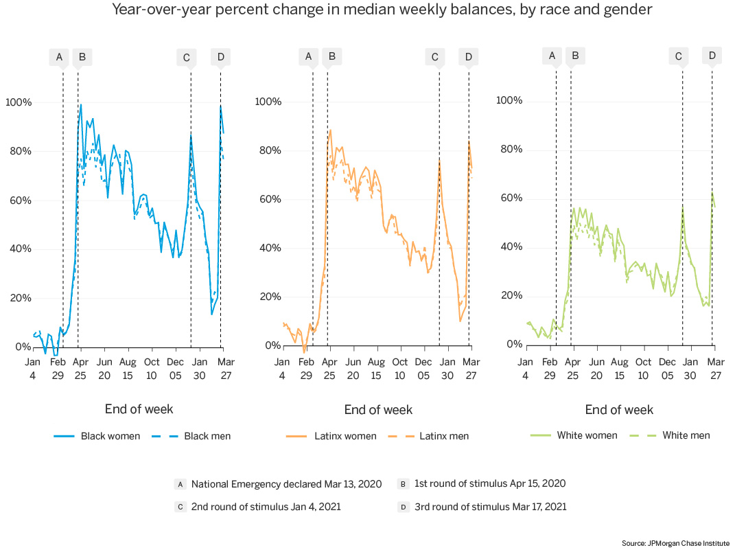
In addition to underlying income differences, it is also important to account for gender when assessing COVID impacts by race. Women of color were particularly vulnerable to the financial effects of the pandemic, and saw differential impacts. The Center for American Progress notes that women of color disproportionately work in industries that experienced significant job losses in the pandemic, as well as working in low-wage jobs with fewer workplace supports (Frye 2020). In addition, Latinx and Black women are far more likely than White women to be single heads of households, making income losses more difficult to absorb. Furthermore, women—particularly women of color—were more likely to lose a job or work hours during the pandemic, and also disproportionately shouldered the childcare burden created by closed or virtual schools and day cares (Covington and Kent 2020). Given the compounding impacts of race and gender, how has the pandemic financially impacted women of color, compared to other groups?
In Figure 6, we track year-over-year percent changes in median balances and see that within-race gender gaps are negligible, aside from the weeks following the first EIP disbursement. In the weeks after the first stimulus payment, women saw greater year-over-year growth than men. This was particularly true for Black female-led households. This raises questions about balance trajectories over time, and how that differs by race and gender.
Figure 6: Black and Latinx female-led households experienced slightly larger boosts to, but faster depletion of, their cash balances during COVID.
Source: JPMorgan Chase Institute
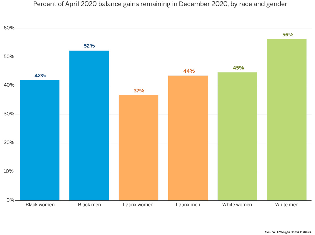
To address those questions, we assess the proportion of median April 2020 balance gains remaining at the end of 20205, and compare these ratios by race and gender groups (Figure 7). Consistently for each race, we see a modest gender gap, with male-led households maintaining a greater proportion of their balance gains (between 44 and 56 percent) than their female counterparts (37 to 45 percent)6. Notably Black and Latinx female-led households experienced that fastest depletion of their cash buffers.
Figure 7: By the end of 2020, female-led households had maintained a smaller proportion of their April balance gains than male-led households; Latina-led households, in particular, lagged other groups.
Source: JPMorgan Chase Institute
We show in subsequent analyses that several factors contributed to these gender gaps, all of which hold true within each race group in our sample. Median balance levels were consistently lower throughout the year for female-led households than for male-led households. Women also had lower cash buffers, with balance-to-spend ratios in female-led households consistently lower than those in male-led households. In addition, income levels were consistently higher for male-led households than for female-led households, and UI recipient rates in our data, specifically for Latina-led and White female-led households, spiked between April and June 2020, indicating decreased inflows for these groups. Even for families whose UI amounts more than replaced their typical paycheck earnings, UI supplements did not cover the full year, and the expiration of those benefits may contribute to female-led households with higher UI rates spending down more of their spring 2020 balance boost.
To understand the drivers behind these balance changes, we assess changes in total account inflows and total account outflows. As Figure 8 shows, total inflows for Black and Latinx families peaked at the time of the first stimulus payment, up roughly 18 percent relative to 2019 inflows, while outflows were marginally depressed (down 3 to 5 percent relative to 2019). White families, on the other hand, experienced a more muted inflow peak (9 percent) coupled with a larger drop in outflows (8 percent), potentially signaling that a greater share of their everyday spending was discretionary. In other words, while median balances increased at the time of the April 2020 stimulus for all race groups, the underlying mechanisms differed: increased account inflows primarily accounted for balance increases for Black and Latinx families, whereas White families experienced a combination of both slight increases in inflows and slight decreases in outflows. Across race groups, both inflows and outflows peaked at high positive changes in January 2021 and March 2021, with the second and third stimulus payments.
Figure 8: Balance increases for Black and Latinx families are driven primarily by increased inflows; White families experienced a more muted inflow increase coupled with a larger decrease in outflows.
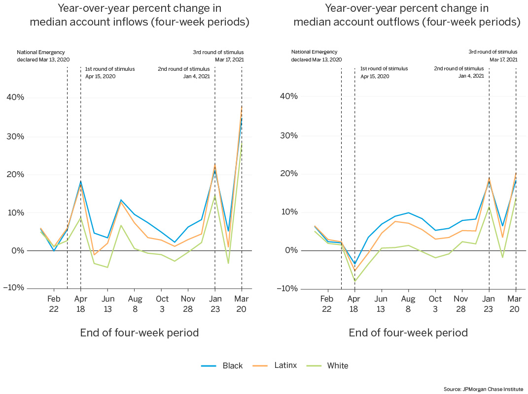
Source: JPMorgan Chase Institute
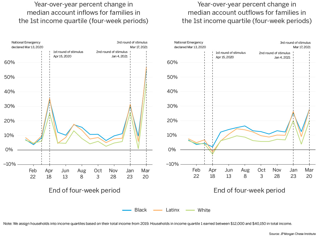
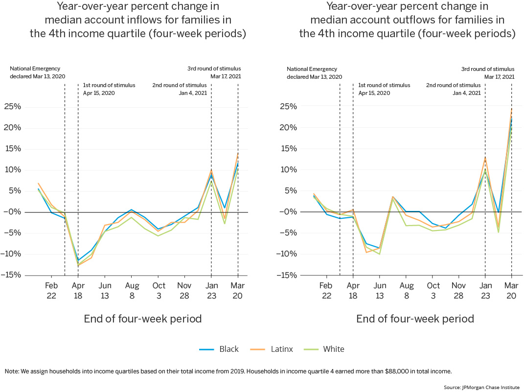
As we have shown in previous work (Greig et al. 2021), aggregate trends in account inflows and outflows differ greatly by income level. We reported that initial pandemic balance increases for low-income families were driven by increases in account inflows, while high-income families offset decreases in inflows by larger decreases in outflows. Indeed, we see that pattern repeated in this sample.7 The lowest-income families experienced year-over-year increases in both account inflows and account outflows throughout 2020, with only a marginally negative outflow dip for White and Latinx families in April (Figure 9a). Within this income group, White families lag Black and Latinx families in percent increases for both inflows and outflows, staying only marginally elevated (roughly 5 percent) relative to 2019 for most of the year, comparable to their pre-pandemic values. For the highest-income families, on the other hand, we see very little difference in percent change levels for White families and their Black and Latinx counterparts (Figure 9b). In this income group, inflows and outflows are both depressed relative to the prior year, for most of 2020, with a marginally positive bump in July 2020 (coinciding with tax time). Families in both income groups also experienced positive peaks in both inflows and outflows in January and March 2021, coinciding with the second and third stimulus payments.
Figure 9a: The lowest-income families experienced year-over-year increases in both inflows and outflows, greater for Black and Latinx families than White families.
Source: JPMorgan Chase Institute
Figure 9b: The highest-income families experienced year-over-year decreases in both inflows and outflows throughout 2020, spiking to increases in January 2021.
Source: JPMorgan Chase Institute
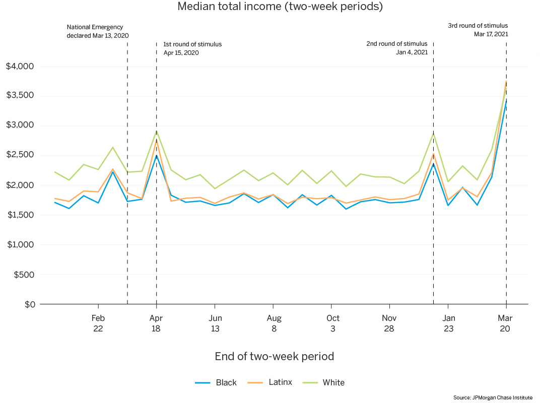
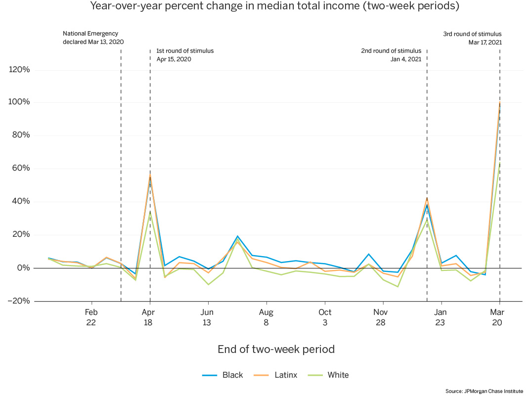
Looking at income trends during the pandemic, we first note that median total biweekly income is consistently $350 to $500 higher for White families than their Black and Latinx counterparts (Figure 10). All groups experienced income spikes coinciding with the stimulus payments in April 2020, January 2021, and March 2021, but median income between those points was somewhat lower for each group than their income prior to the first stimulus payment.
Indeed, on a year-over-year basis, White families have marginally depressed income for much of 2020 (Figure 11). Latinx families have income roughly at parity with 2019 levels for most of 2020, while Black families have marginally elevated income for much of the year8.
Figure 10: Median total income is notably higher for White families; for each race group, we observe income spikes coinciding with stimulus payments in April 2020, January 2021, and March 2021.
Source: JPMorgan Chase Institute
Figure 11: Year over year, median total income was marginally depressed for White families for most of 2020, and marginally elevated for Black families; all groups experienced positive spikes coinciding with stimulus payments in April 2020, January 2021, and March 2021.
Source: JPMorgan Chase Institute
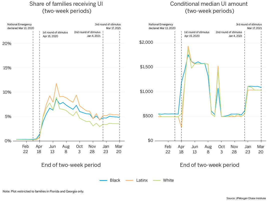
UI benefits may be contributing to year-over-year increases in median income levels. The share of families receiving UI varies by race. Note that we observe UI receipt via direct deposit to a family’s Chase checking accounts and cannot capture benefits disbursed through other channels. If people of color are more likely to receive benefits via alternate channels, such as prepaid debit cards, then our measurements will underestimate their prevalence in the UI pool. What we observe in our data may be a lower bound on racial differences in UI receipt.9
Consistent with unemployment trends at the time, we see that all race groups experienced dramatic increases in UI receipt rates during April and May 2020, with Latinx families experiencing the highest post-National Emergency UI rates. Initially in the early spring of 2020, Black families lagged White families in UI receipt, but this rank-ordering changed by mid-July, with Black families’ rates surpassing White families’.
This relative delay in UI receipt among Black families does not mirror unemployment trends by race, which show an immediate and much larger spike in unemployment among Black workers than White workers in April of 2020. A number of factors could contribute to this relative delay. It could be that Black families took longer to apply for these benefits. Alternatively, it could be that after applying, it took Black workers longer to receive these benefits. For example, Black households may have disproportionately benefited from the CARES Act expansion of unemployment eligibility to self-employed, “gig workers,” and those with limited work histories, via the Pandemic Unemployment Assistance (PUA) program (Bell et al., 2021). State and national UI claims data indicate larger delays in the PUA program than regular UI (Bell et al., 2021; Shierholz, 2021), since it was a new program that states had to stand up. Large numbers of previously ineligible families could contribute to the larger increases in UI rates we observe for Black families at this time. It may also be that Black families were more likely to initially receive UI benefits via pre-paid debit cards, and then gradually shifted towards receiving benefits via direct deposit into their bank accounts.
Conditional on receiving UI, the median benefit amount received is comparable across races but varies over time10 (Figure 12). Jobless workers received supplemental unemployment benefits through July 2020 as a result of the CARES Act, again in September through Lost Wages Assistance, and then again since January 2021 from the American Rescue Plan. These supplemental benefits more than replaced typical earnings for some families and led to considerable savings (Ganong et al. 2020; Greig et al. 2021).
Figure 12: Latinx families have the highest rates of direct deposit UI receipt; UI receipt for Black families is initially lower than for White families, but surpasses White families later in the summer.
Source: JPMorgan Chase Institute
To understand the trends in total outflows by race, we look to the two largest categories of outflows11: total spend and outflow transfers. We define total spend as the sum of several outflow categories: debit card transactions, cash withdrawals and cash-back interactions, utility payments, and credit card payments (to both Chase and non-Chase accounts)12. In this sense the spending measure we use captures everyday spending, including basic necessities like groceries and utilities. The outflow transfer category represents outflow transactions from families’ Chase checking accounts to other accounts. These transfers may land in savings or investment accounts, or other non-Chase checking accounts, which may be owned by the originating family or another family.
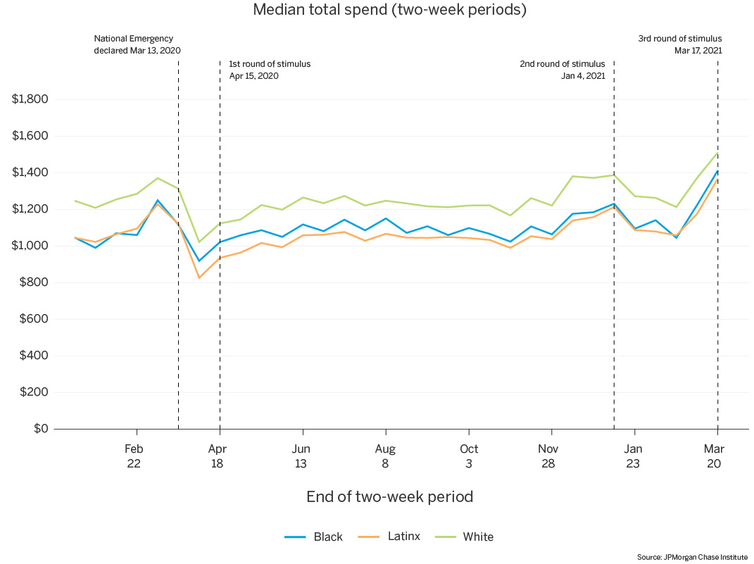
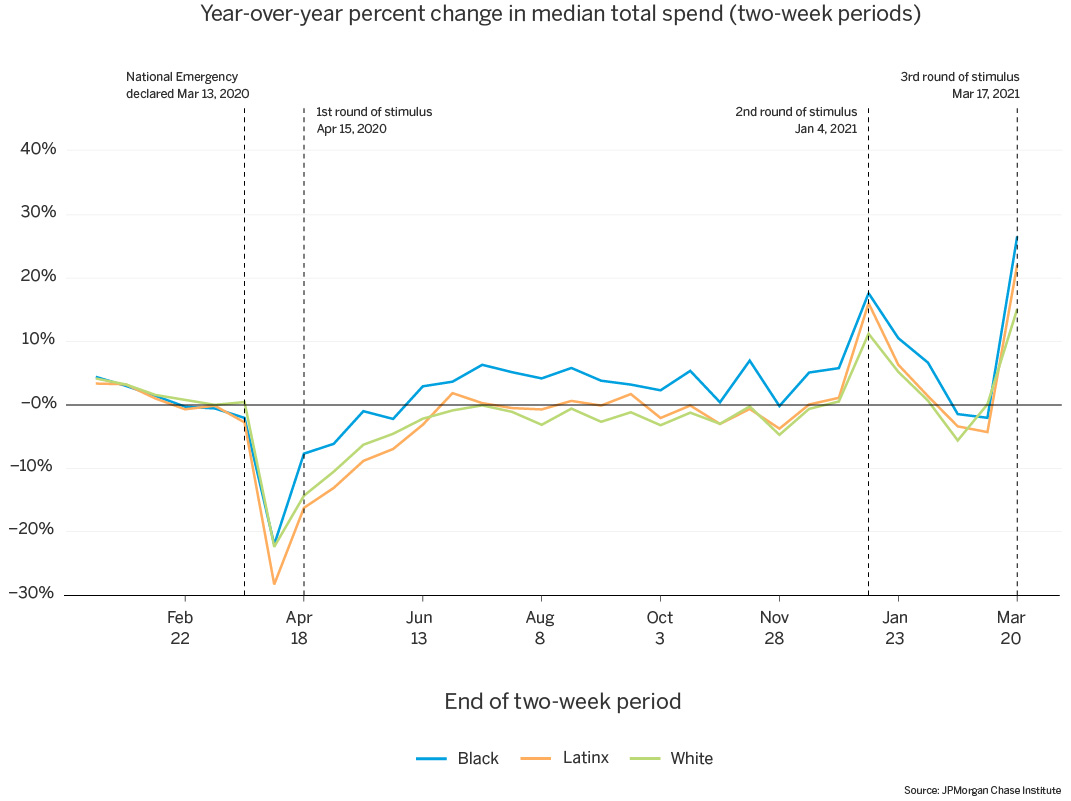
Starting with total spend, Figure 13 shows that median biweekly total spend for White families consistently outpaced that of Black and Latinx families by $100 to $200. For each race group, median spend decreased following the National Emergency declaration in March 2020, rebounded somewhat by the summer, and increased in the final weeks of 2020, through the January 2021 stimulus payment, with another peak coinciding with the March 2021 stimulus payment. The March 2020 decreases were very large relative to 2019 spend: Black and White families’ spend was down by 22 percent, and Latinx families experienced an even bigger decrease, down 28 percent relative to 2019 (Figure 14). Throughout the rest of 2020, Black families’ spending recovered more quickly than White and Latinx families’ spending. With the arrival of the second and third stimulus payments in January and March 2021, spending increased to a greater extent for Black and Latinx families than that of White families, returning to slightly below the prior year’s levels in between the second and third stimulus payments.
Figure 13: Median total spend is notably higher for White families; for each race group, spend decreased after the National Emergency declaration, and increased at the end of 2020 and the January 2021 and March 2021 stimulus payments.
Source: JPMorgan Chase Institute
Figure 14: In early April 2020, spending was down relative to 2019, with Latinx families’ spend falling the most; Black families rebounded to pre-pandemic spending the fastest.
Source: JPMorgan Chase Institute
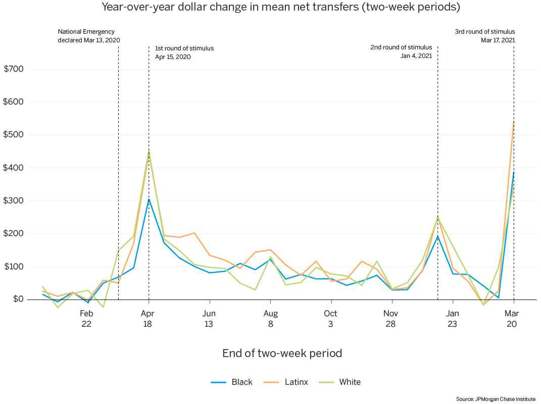
Our second largest outflow category, outflow transfers, represents transfers from a family’s checking account(s) to some other account. This can either represent a family self-investing by moving funds into their own savings or investment accounts, or it can represent a family supporting others by transferring funds to another family’s accounts. We measure net transfers for a family as outflow transfers minus inflow transfers and assess year-over-year changes in this metric in Figure 15. Mean net transfers increased leading up to the first stimulus payment in April 2020, and spiked that week, most dramatically for White and Latinx families. These increases were a combination of changes in inflow transfer behavior, and changes in outflow transfer behavior. In the weeks between the National Emergency declaration and the first stimulus payment, the share of families receiving inflow transfers to their checking accounts (either from their own accounts or from others) decreased by 5 to 7 percentage points for each race group, while the conditional amount of inflow transfers remained steady. On the outflows side, the share of families making transfers out of their checking accounts held steady during the spring of 2020, but saw a notable increase in the conditional transfer amount coinciding with the first stimulus payment. Throughout the remainder of 2020, all groups had elevated net transfers relative to 2019, with Latinx families remaining more elevated than Black and White families during the spring and summer. Net transfers spiked again in January and March 2021, coinciding with the second and third stimulus payments, indicating greater outflow transfers at these times.
Figure 15: Transfers out of checking accounts spiked in the weeks of the first and second stimulus payments, and Latinx families experienced elevated transfers out throughout the summer of 2020.
Source: JPMorgan Chase Institute
While total spend and outflow transfers make up the largest portions of total outflows, we further decomposed outflows into additional components to assess other noteworthy changes13. In particular, we wondered how the pandemic had impacted debt payments, and whether that differed by race. While debt payments were slightly depressed year-over-year for all race groups—somewhat more so for White families—the marginally negative values were steady throughout 2020. In other words, we did not observe large changes in debt payment behavior coinciding with key pandemic events, such as stimulus payments. See our recent work on liquid balances (Greig et al. 2021) for additional exploration of debt payment behavior during the pandemic.
Pandemic-based financial need was not evenly distributed by race. Public data on unemployment shows an immediate and much larger spike in unemployment among Black and Latinx workers than White workers in April 2020 and a slower subsequent recovery in employment. Our own data show that Black and Latinx families began the COVID-19 pandemic with lower levels of cash liquidity, implying greater vulnerability to job loss. Thus, the COVID recession repeated a common pattern in downturns: the most financially precarious racial groups—Black and Latinx workers—were among the first to lose their jobs and the last to be hired as the labor market gains strength.
Pandemic-related government supports were progressive in that they delivered cash to low-liquidity families, disproportionately boosting the cash balances of Black and Latinx families. Lower-income families, as well as Black and Latinx families, saw greater percent increases in balances and inflows. Stimulus payments provided additional cash buffer to help alleviate the immediate threats to families’ financial wellbeing. Additionally, Black and Latinx families exhibit higher rates of direct deposit UI receipt. Stimulus and UI supplements resulted in income growth for Black and Latinx families during the pandemic. While cash balances increased for each race group, these changes were driven primarily by increased inflows—boosted by government income supports—for Black and Latinx families. In contrast, White families experienced smaller inflow increases coupled with larger decreases in outflows, potentially signaling that a greater share of their everyday spending was discretionary.
Financial supports enabled families to continue their everyday spending, particularly for Black families. Previous JPMC Institute work has shown that families with lower liquid asset buffers—disproportionately Black and Latinx families—exhibit a larger marginal propensity to consume when a tax refund arrives (Farrell et al. 2020). This is consistent with our findings here, where we observe Black families rebounding to pre-pandemic spending the fastest following the first round stimulus payments.
Black and Latinx families’ balances depleted faster than White families’, signaling the criticality, but also temporary nature, of those supports. After the first stimulus payment, families maintained higher-than-usual checking account balances for many months, gradually spending down balance gains over the remainder of 2020. While median cash balances were still elevated at year’s end, Black and Latinx families maintained a smaller proportion of their initial balance boost than White families (Figure 3). The fact that Black and Latinx families depleted their cash balances faster than White families after each round of stimulus may indicate that families of color faced circumstances that made it more difficult to maintain a cash buffer. It underscores the relative precarity of their financial position should they experience more prolonged unemployment.
Figure A1: Relative to the Survey of Consumer Finances, the families in our sample have higher income and lower checking account balances.
Source: JPMorgan Chase Institute
Figure A2: Relative to the Survey of Consumer Finances, our sample slightly overstates income ratios between Black and Latinx families and their White counterparts; checking account balance ratios are much more notably overstated relative to the national benchmark.
Source: JPMorgan Chase Institute
Demographics measured in this report—race and gender—reflect the characteristics of the primary account holder, in cases with multiple individuals attached to a families’ set of accounts. Note that we observe only the characteristics of the primary account holder, and use this to discuss the family as a whole (e.g. “Black families”) although other household members may not share the same demographic characteristics as the primary account holder.
For benchmarking our balance and income results, we refer to the same data metrics obtained from the Survey of Consumer Finances (2019) for our three race groups. In order to obtain a sample characteristically similar to our Chase sample, we apply two filters: 1) remove households with no checking account balances and 2) subset to households whose checking accounts are held at commercial financial institutions. Additional background information on the survey and its data can be found here: https://www.federalreserve.gov/econres/scfindex.htm
As our analysis focuses on three race groups—Black, Latinx, and White—we use “families of color,” “women of color,” or similar to reference results for Black and Latinx families.
While these ratios tend to change in April—increasing 3 to 4 percentage points in the same timeframe in 2019—the April 2020 ratios are still 10 percentage points greater than the 2019 ratios. In other words, though seasonal changes have an impact, 2020 changes are much greater than expected in a typical year.
Specifically, we calculate the year-over-year balance difference in December 2020 as a proportion of the same metric in April 2020: (median balance year-over-year dollar increase at week 52) / (median balance year-over-year dollar increase at week 19)
Note that this could be conflating gender with household composition, if male-led families are more likely to have multiple adults. That would skew the male-led families toward higher-income households, which we would expect to finish the year with higher balances, thus capturing an income effect rather than a gender effect. However, when we separate this analysis by income group, we still consistently see gender gaps for each race.
As noted elsewhere, White families skew toward higher income than Black and Latinx families. In our sample, 33 percent of the White families are in the highest income group, with only 19 percent in the lowest income group. We see the reverse for Black and Latinx families: roughly 30 percent are in the lowest income group, with only 15 to 19 percent in the highest. Thus, the differences in overall inflow and outflow trends for White families documented in Figure 8 are partially due to the higher concentration of high-income families in that group, pulling the trends downward.
Our choice of two-week periods results in a smooth income series for families who receive paychecks on a biweekly cadence, which results in one paycheck per period in our series. However, families receiving paychecks bi-monthly will occasionally receive no paycheck in a two-week period. This no-paycheck anomaly occurs in early July 2019, resulting in lower-than-typical median labor inflows for that period. When calculating changes on a year-over-year basis, the net effect is artificially inflated values in late July.
Data from the Federal Reserve show that the bulk of unemployment benefits nationally are paid via prepaid debit card, which we do not observe (Federal Reserve Board, 2019). And if prepaid debit card recipients vary by race—e.g. if they are disproportionately workers of color—then our data will likely understate the gaps between recipiency rates by race.
We observe changes in UI amounts consistent with policy changes: The CARES Act expanded unemployment benefits via the Federal Pandemic Unemployment Compensation (FPUC), which provided a supplement of $600 per week from April through July 2020 for everyone receiving unemployment benefits. While FPUC originally expired on July 31, 2020, states paid out an additional $300 per week in Lost Wages assistance in September and October, and the Coronavirus Response and Relief Supplemental Appropriations Act of 2021 reauthorized the $300 weekly supplement beginning after December 26, 2020.
In addition to total spend and outflow transfers, paper checks and “other” outflows constitute a large portion of checking account outflows. These categories contribute the remainder of the larger decrease in outflows for White families in April 2020 that we observe in Figure 8. White families show a marked decrease in paper check outflows and other outflows in April 2020, and a corresponding increase in July 2020. This is driven by tax payments, and the shift in tax deadline from April to July for 2019 tax filing. These changes are not present for Black or Latinx families.
Our total spend measure is therefore a measure consumption, excluding other expenditures such as debt and rent payments. While we do not study rent by race here, a recent JPMorgan Chase Institute report outlines income and liquid asset trends during COVID-19 for renters compared with homeowners.
See End Note 11.
Bell, Alex, Thomas J. Hedin, Roozbeh Moghadam, Geoffrey Schnorr, and Till von Wachter. 2021. “Half of the UI Recipients in California Are Now Considered ‘Long-Term Unemployed’.” California Policy Lab. https://www.capolicylab.org/publications/march-18th-analysis-of-unemployment-insurance-claims-in-california-during-the-covid-19-pandemic/
Centers for Disease Control and Prevention. 2021. “Health Equity Considerations and Racial and Ethnic Minority Groups,” Centers for Disease Control and Prevention, Updated April 19, 2021.
Covington, Meredith, and Ana H. Kent. December 2020. “The ‘She-Cession’ Persists, Especially for Women of Color.” Federal Reserve Bank of St. Louis. https://www.stlouisfed.org/on-the-economy/2020/december/she-cession-persists-women-of-color
Farrell, Diana, Fiona Greig, Chris Wheat, Max Liebeskind, Peter Ganong, Damon Jones, and Pascal Noel. 2020. “Racial Gaps in Financial Outcomes: Big Data Evidence.” JPMorgan Chase Institute. https://www.jpmorganchase.com/content/dam/jpmc/jpmorgan-chase-and-co/institute/pdf/institute-race-report.pdf
Frye, Jocelyn. April 2020. “On the Frontlines at Work and at Home: The Disproportionate Economic Effects of the Coronavirus Pandemic on Women of Color.” Center for American Progress. https://www.americanprogress.org/issues/women/reports/2020/04/23/483846/frontlines-work-home/
Ganong, Peter, Pascal Noel, and Joseph Vavra. 2020. “US unemployment insurance replacement rates during the pandemic.” Journal of Public Economics 191. https://linkinghub.elsevier.com/retrieve/pii/S0047272720301377
Greig, Fiona, Daniel M. Sullivan, Max Liebeskind, Peter Ganong, Pascal Noel, Joseph Vavra, “Unemployment insurance, job search, and spending during the pandemic, ” February 2021, https://www.jpmorganchase.com/content/dam/jpmc/jpmorgan-chase-and-co/institute/pdf/Institute-UI-Research-Brief-ADA.pdf
Greig, Fiona, Erica Deadman, and Pascal Noel. 2021. “Family cash balances, income, and expenditures trends through 2021: A Distributional Perspective.” JPMorgan Chase Institute. https://www.jpmorganchase.com/insights/all-topics/financial-health-wealth-creation/family-cash-balances-income-and-expenditures-trends-through-2021
JPMorgan Chase Institute. 2021. “Household Finances Pulse: Cash Balances during COVID-19. https://www.jpmorganchase.com/insights/all-topics/financial-health-wealth-creation/household-finances-pulse-cash-balances-during-COVID-19
Shierholz, Heidi. 2021. “One year later, unemployment insurance claims remain sky-high.” Economic Policy Institute. https://www.epi.org/blog/one-year-later-unemployment-insurance-claims-remain-sky-high/.
U.S. Bureau of Labor Statistics. “Labor Force Statistics from the Current Population Survey.” April 2021. https://www.bls.gov/web/empsit/cpsee_e16.htm
We thank our research team, specifically Samantha Anderson, Bernard Ho, and Pascal Noel for their hard work and contributions to this research.
Additionally, we thank Anna Garnitz and Sruthi Rao for their support. We are indebted to our internal partners and colleagues, who support delivery of our agenda in a myriad of ways, and acknowledge their contributions to each and all releases.
We would like to acknowledge Jamie Dimon, CEO of JPMorgan Chase & Co., for his vision and leadership in establishing the Institute and enabling the ongoing research agenda. We remain deeply grateful to Peter Scher, Head of Corporate Responsibility, Heather Higginbottom, President of the JPMC PolicyCenter, and others across the firm for the resources and support to pioneer a new approach to contribute to global economic analysis and insight.
Authors

Fiona Greig
Former Co-President

Erica Deadman
Consumer Research Lead